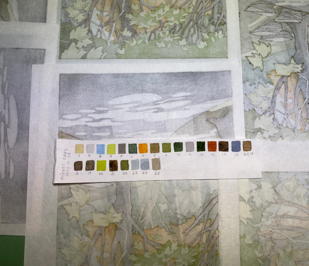
What did I do in 2022? I finally finished Forest Rays! At least I think I am done. The prints are still in the drying boards and will need a careful look-over before I add them to the store, but here’s a preview. I think I captured the feeling I was looking for – humid forest, light streaming through the branches, leaves caught in sunlight glowing brightly.
7 pieces of wood (6 self-made cherry ply and 1 shina ply from McClain’s), 19 printable areas including the key block, 25 impressions. (I had prepared separate key lines for the trees and foliage in the distance, but decided not to use them – that would have made 26 impressions!)
back of some prints and colors usedbefore the rays and key linesdrying
The paper is Shin Hosho from Woodlike Matsumura. When I started printing, I thought “Excellent, this paper is really tough, and I’ll need it for this print!” but by the end it was quite soft and barely hanging on. I had thrown in a few sheets of Student Kozo as warm-up sheets, but I gave up on them about 18 impressions in because they were fouling the blocks with fibers that kept coming off.
I’m looking forward to the next print! It will be a simple one, and I’ll aim to finish within a month – fingers crossed. Back to the carving bench!
I’ve had a really productive day doing print-related things! I moistened the paper that I will use for Forest Rays.
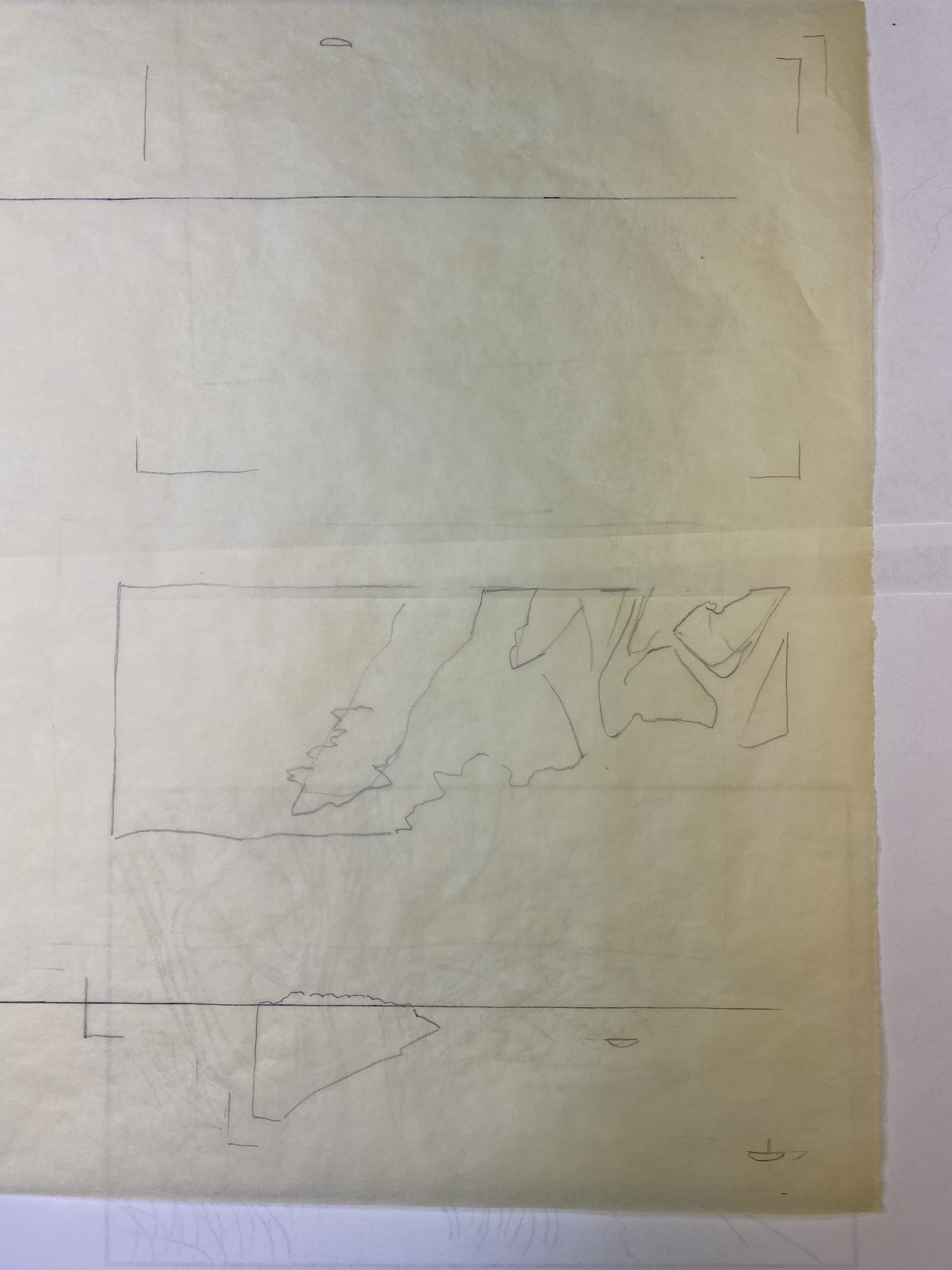
I decided to remove part of one of the columns of shadow, since it didn’t really look right overlapping the foliage at the top. I also decided to carve the other side of the shina ply I used for the newest block, to add deepness to that upper foliage while preserving some highlights. So, I made two new transfer sheets.
In the middle above is the current state of my test print inside a plastic bag, with the key lines added. The part of the shadow column I want to remove is about 1/3 of the way from the right edge – the part that crosses the lighter green at the top. Before pasting down the transfer to the shadow block (above right), I lightly cut the gampi with a knife so it would pull away from the backing sheet, then put glue only on that area, and pasted it down. You can see the place it formerly occupied in the transfer sheet remnants on the lower right. On far left is the second transfer sheet marked up for shading the foliage, and (why not, while I am at it!) shadows for the rocks.
Instead of starting in on the new carving, I printed the first impression of Forest Rays. I can carve later, when I have a few minutes, but printing takes a chunk of time, and today I had the time.
I’m printing on some Shin Hosho I got from Woodlike Matsumura a few years back. It’s pretty tough paper! I’m able to rub it without a sheet of baking parchment to protect it. One drawback is the kind of “chiri” in the paper. All handmade kozo paper has bits of junk – bark, dirt, etc. – included in it. This one has tiny rocks! I picked out 4 little rocks (OK, they are sand grains, but large ones) in these 23 pieces of washi before starting the print run. This is important so as not to damage the blocks or the baren. Other than that, I like this paper a lot. It is tough and dimensionally stable. It needs a lot of pressure for a smooth impression, but using that, it is possible to print quite smoothly.
So, I’ve officially started printing Forest Rays! No telling how long it will take; the test print has 27 or so impressions so far and that is not all of them. Also, JLPT (Japanese Language Proficiency Test) is next week and I really need to study!
I’m in my 4th round of test printing for the Forest Rays project. It’s been a bit of a struggle, mostly because there are so many areas to print – 11 wood faces, 18 printable areas, 18 sets of registration marks, and lots of areas that overlap so they get printed multiple times.
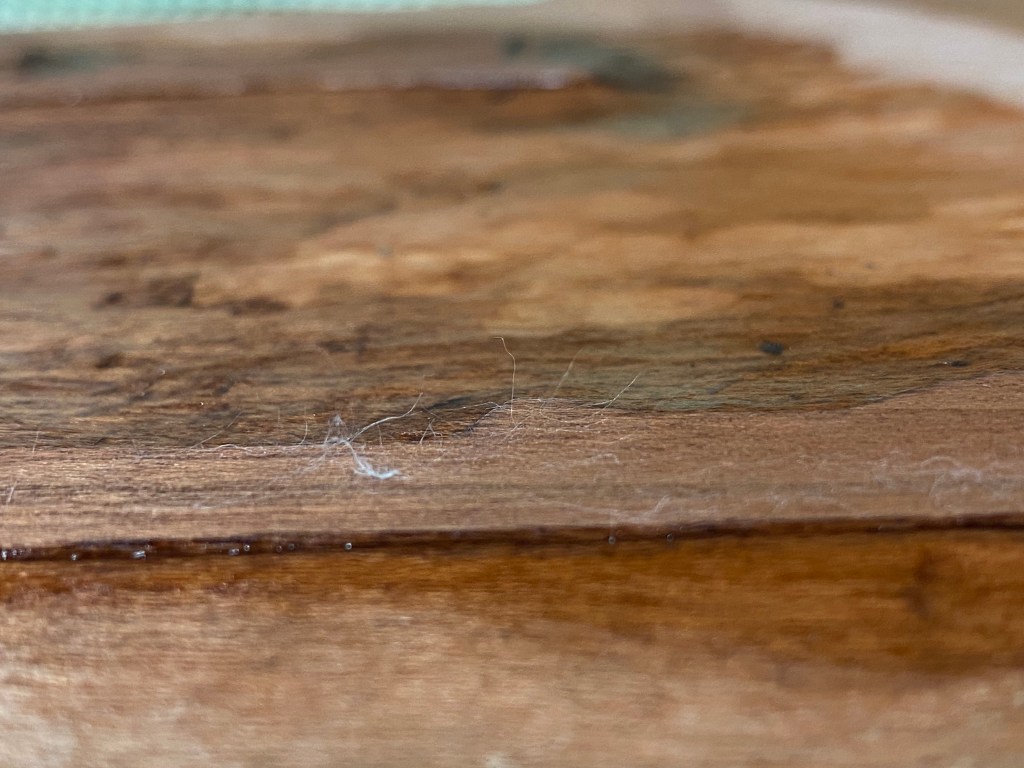
I recently received some “Student Kozo” paper from Kitaro, and with some hope, am using it for this round of testing. Unfortunately it’s weak and floppy when damp, and seems to shrink and swell more than I’d like. And more frustrating for testing this particular print, when an area gets more than one or two impressions, fibers start to separate from the face of the paper; you can see that below.
I’m plowing forward despite the frustrations, and am succeeding at my aim to get more pigment onto the prints! Pretty soon though, I need to just take the plunge and actually print the things. I have a stack of Shin Hosho from Wood Like Matsumura set aside for this one; that paper is pretty tough!
I wonder if I might be able to add more sizing to this paper to toughen it up and be able to have less trouble testing prints that have lots of overlays. At any rate, it’s pretty nice for the price, so I can use it for simple prints without many overlapping colors.
It’s a roll of 10 sheets of the “student” 100% kozo (mulberry) paper from Kitaro. The top blue line says, 越前手漉き和紙、aka “Echizen tesuki washi”, or Echizen handmade Japanese paper. I’m looking forward to trying it out! It’s quite inexpensive for 100% mulberry paper. I’m not sure what makes it student grade – imperfections, maybe? I won’t really know until I plan some prints, take some out, and slice up a sheet for testing. From first inspection, it seems nice and sturdy, so hopefully the sizing is adequate. Who knows, maybe this paper will be worth more than testing material?
(Image credit to my friend Lou Hurlbut for the little print you can see on the wall!)
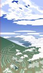
Planning new prints. Ahem. I’ve been stuck in that stage for awhile since I returned from Japan. I’ve got two ideas going – I will hint at them in cartoon form. These are purposefully low-res images because the designs are not final and a hi-res digital image just looks quite fake.
This one is taking lots of time to develop and I may not ever get there! But I love the idea.
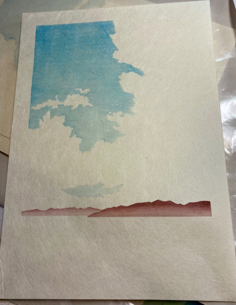
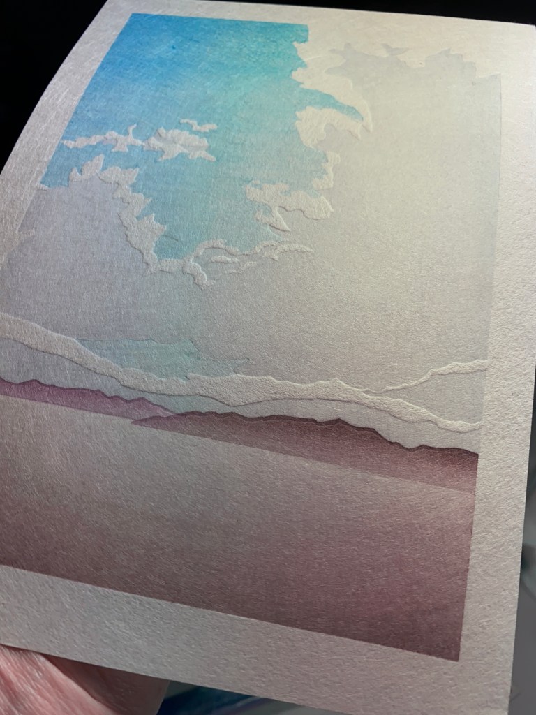
This one is close! Obviously clouds are a recurring theme in these ideas. This was a real cloud that I saw in Junction, Texas. We wanted rain sooo bad! It was raining over there, 80 miles away where the cloud was, but not where we were. As the sun set, the colors just got more and more dramatic.
You can find it here. I’m pleased with this one; it’s really simple, but the embossing and gradations turned out well.
I have a few printing progress shots:
2nd impression3rd4th5th6th – another on the sky7th – cloud gradation
After the 7th impression shown in the last photo, there were four more: a third gradation on the sky, two to build the medium shadows on the cloud, and one for the darkest cloud shadows.
I ended up with quite a stack of prints! However three were mistakes, and 5 had paper flaws that make them seconds. There were more bark fragments in these sheets than in the last sheets from this batch.
When I first conceived of this print, I imagined doing it all in monochrome, probably in Prussian blue. So I started doing test prints on card stock, and I tried having it damp like normal washi for printing, hoping that that would keep it from wrinkling so I could do multiple impressions. Right away I realized that the Prussian blue I was trying to use was NOT the right hue, so I printed over that pretty quickly with some Payne’s gray on the sky and some olive and Payne’s on the foliage. That’s the test on the left. Some of the Prussian blue is sort of preserved on the little hill on the far left – it was much more turquoise than I expected.
Another thing I noticed is just how much the card stock changes size with variation in moisture content! The leftmost try is registered pretty well because I did it all in one go and the paper did not dry much. But the others are horribly registered, especially on the right of the image, because these tiny pieces of paper shrank almost an eighth of an inch in width! Finally, something weird was going on with those vertical lines in the sky. Was it the paper or the block? I’m afraid it might be the block because it’s got some rough areas due to crazy grain in that area. I actually took a very fine, 1500 grit, piece of sandpaper to it, to try to reduce the roughness. I was really careful to avoid rounding the edges or hollowing out a hole. That seems to have helped a little – the top-most try was printed last of these three, and the lines seem less prominent. So I sanded a little more.
The next few test prints were done using Shin Torinoko, an economical Japanese paper that is sized, machine made, and with a fiber content of linen and pine pulp. It’s pretty different from what I will ultimately print on, but it is dimensionally stable and can take multiple impressions. I would really like to find a better paper for test-printing, but haven’t found one yet that is inexpensive enough, adequately sized, and tough.
Anyway, here I am really moving away from the monochrome idea! I like the brown key lines, as opposed to blue. I tested whether it would be better to have shadows in the valleys between the hills on the left of the image, or mist; I prefer the mist. I like the greenish hills of the upper right image better than the gold-ish ones on the left image. I’m trying to use a bokashi to add shadows to the foliage, and that sort of works for the trees, but given where I want the shadows in the background foliage, it’s hard to control.
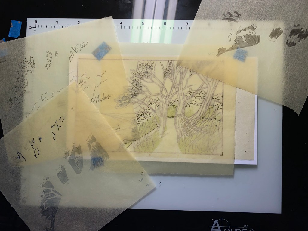
So, kicking and screaming a little (but not really, because it means I get to carve some more), I started thinking about another block to add shadows in a more controlled way. I made a few more transfer sheets and printed the key block. Because I didn’t make any key lines to delineate the path, but I really needed to know where its edge lay, I also printed that part on one of my transfers – that’s the green you see through the tracing paper below. I made a bunch of shadow sketches on tracing paper, before deciding how to approach it.
I can just barely see the outlines of the trace-paper shadow areas through the transfer sheet with the light table turned all the way up!
I think these areas will all go into the same impression (using a single set of registration marks).
So, getting closer to actually printing! The test prints are still damp, still in the freezer, and ready for testing the shadows when this next block is ready.
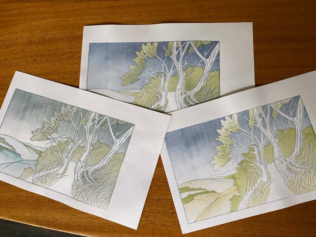
Nope, not adding a block to the forest rays print! The truth is, I just don’t have the time to start printing that one. I need several continuous days without many other responsibilities; I think I will need to take vacation to do the printing. Carving, however, is something I can spend a couple of hours on here and there. Plus I really love carving! So, motivated by that excitement and a new design idea, I’ve prepared another block. I’ve used a card scraper to smooth the surface – it yields the same kind of surface that can be achieved with a hand plane, but is a lot less expensive and requires less skill to use.
Since the last design was so complicated, for this one, I am aiming for simple simple simple. All the impressions will fit on ONE piece of wood (with two laminated cherry faces). I’m thinking monochrome too!
I got everything ready before starting the carving. I figured out the final size, cut the paper, and planned out where on the wood each impression will go.
pencil sketchblock planningblock planningpaper is readyhanshita is good to go!
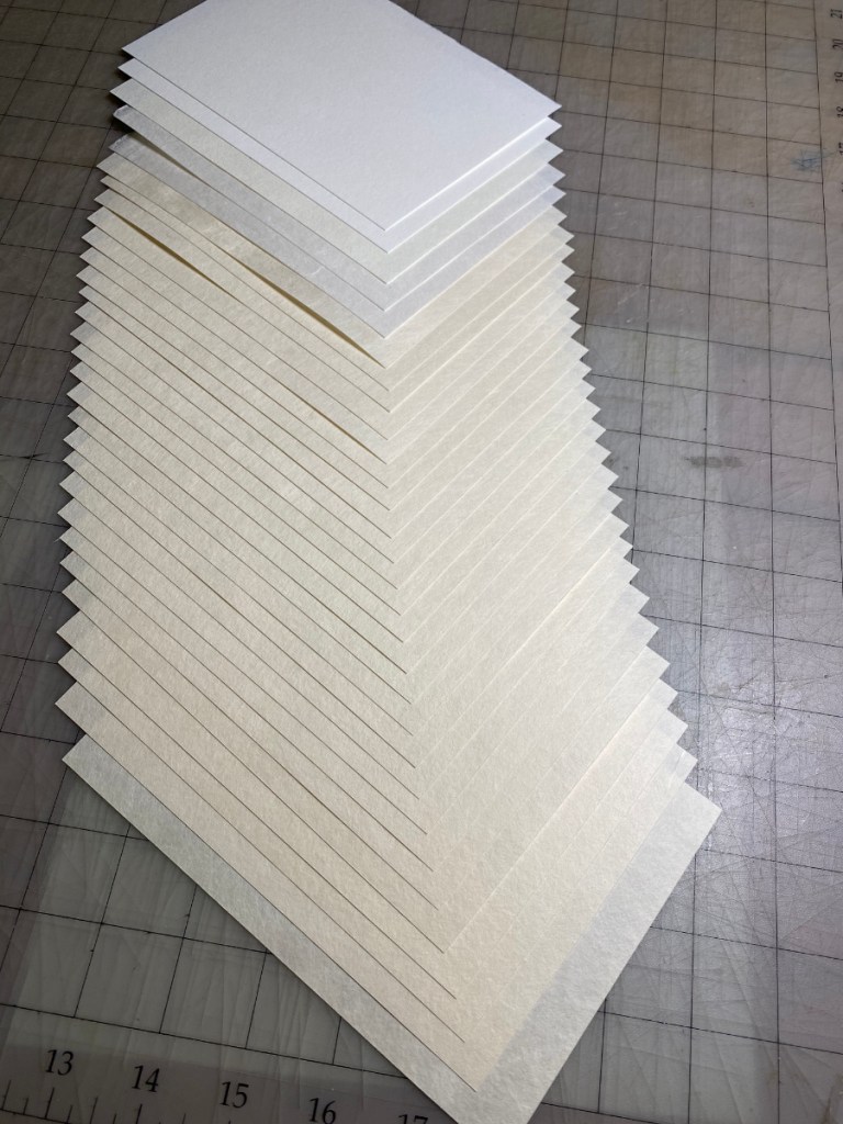
A few of the sheets of washi have some flaws. One has a tiny blood stain because I trimmed off the very tip of my thumb cutting them 😦 and others had some bends in the paper. I’ll print them all – the sheets with slight bends might turn out fine after being dampened and printed. The sheets with (possible) flaws got a little line as a corner mark; the others got a dot on the corner that is the squarest, which will go into the corner kento when it’s time to print. 50 sheets in all! My biggest print run yet.
Now to paste down that hanshita and take a knife to the block!
It’s so much more pleasant to print on quality washi! This time I am using the Kizuki from Kitaro. I’m 4 impressions in at this point; here’s what the print looks like after 3. I did two impressions of the yellow to build the color and get a smoother tone.
Here’s the paper I will use for the current print. I’ve got 25 pieces of Kitaro’s Kizuki, and 5 pieces of a few other kinds I had lying around that I will use for testing. Because this is a really small print, I picked a sheet of the Kizuki that was on the thin side. It’s a completely handmade product, and there’s actually noticeable variation in the thickness.
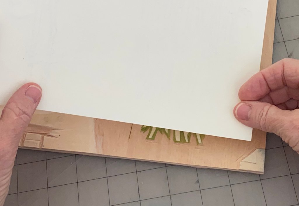
I’m applying a small dot of clear nail polish to one corner – the corner that will be inserted into the corner kento (registration notch) – of each piece of paper. This is a trick I learned from the printers at Mokuhankan. For a simple print with only one or two impressions it wouldn’t be that important, but reinforcing this corner prevents it from wearing and changing shape with repeated impressions. That way it’s possible to get precise registration every time.
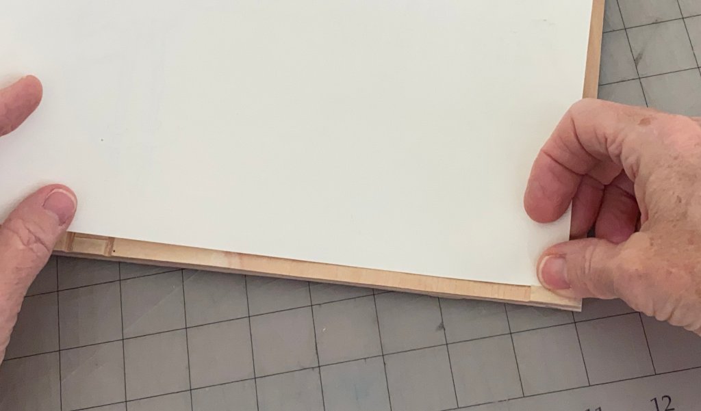
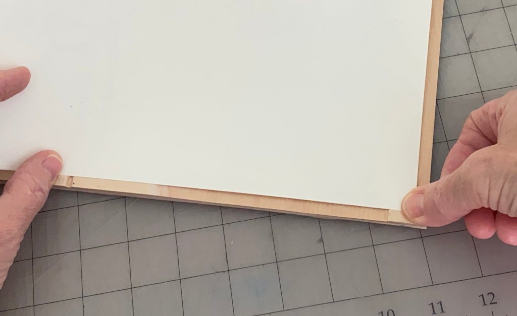
Here’s how the paper is placed when printing. I’m demonstrating with a block for a different print. First the corner is inserted into the corner notch on the right, then it’s placed against the little ledge on the bottom left, then laid flat on the block. It’s not necessary to reinforce the edge on the bottom left, but the corner can easily wear if it’s not strengthened!
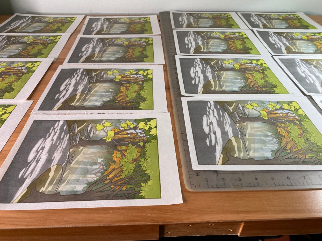
I apologize for not posting much in the way of in-progress notes about this print. There are some things I’d like to talk about, and I might get to them eventually. But in the mean time, I’m done! Here are some shots of the prints drying.
This print run included 30 prints – 4 on Shin Torinoko as practice prints, 20 on Kitaro’s (https://www.washi-kitaro.com/) Kizuki, and 6 on the Shin Hosho I ordered from Matsumura-san. There’s some variation in thickness in each of these washi batches. One of the sheets from Kitaro was noticeably thicker than the others; this didn’t seem to affect the printing very much, though. The Shin Hosho sheet I used was thinner than any of the sheets I used for the Naoshima Coast print, and I really liked printing on it! It was easy to get a smooth, intense impression. You might remember I struggled with smooth impressions on the Naoshima print. I think if all the sheets had been like this one, printing would have been a piece of cake!
Here’s an example of the finished print, held so the embossing can be seen. This is one of the Shin Hosho sheets, but the Kizuki prints also turned out quite nicely; the paper color is a little creamier on those.