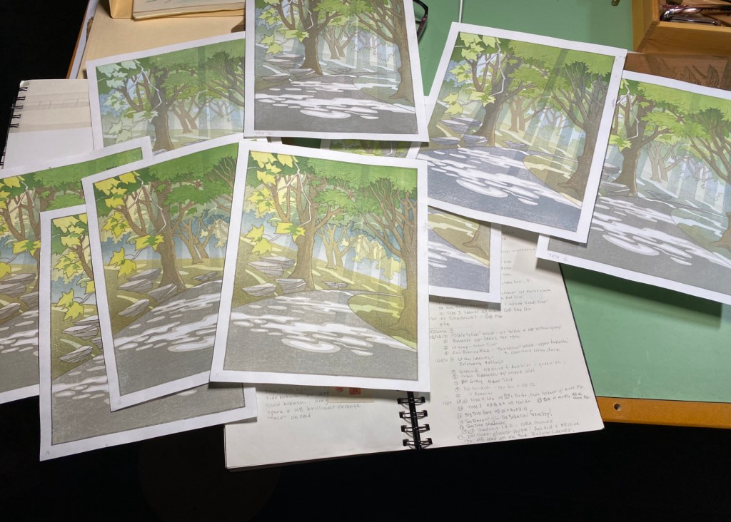
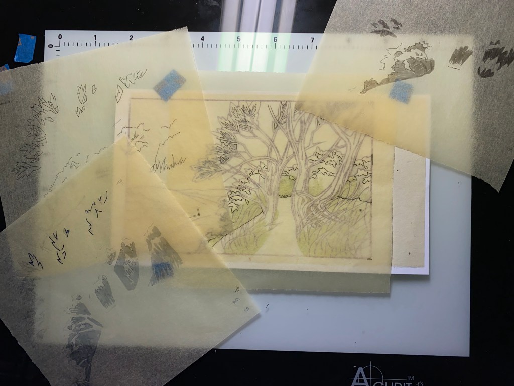
I’m nearing the end of this test printing and I think I’ve solved a problem that was bothering me – what to do with the trees that are in the middle distance. I’ll show you in a bit. But first, yes – I carved another block.
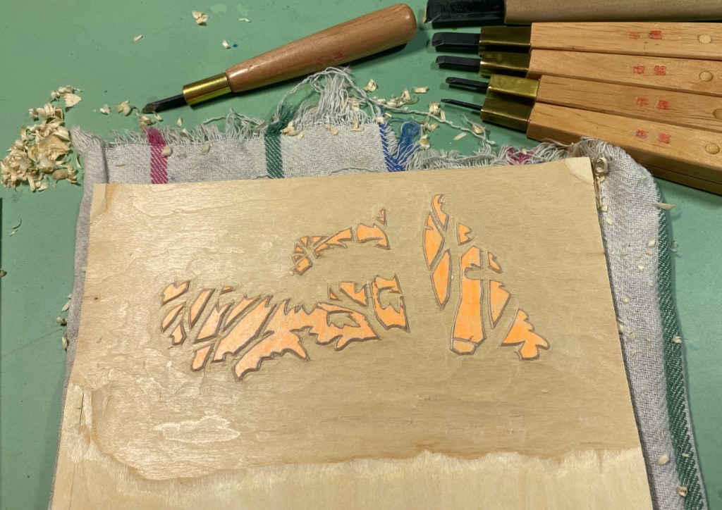
I just needed a little more color on those middle trees – this will be a bright color over their whole leaf surface, so that I can have some highlights more in line with the color the shadows will be. I’ll show you most of the stages of the test print so far.


The exposures are all a little different so the colors aren’t showing up exactly the same in each case, and it may be hard to see what changed.
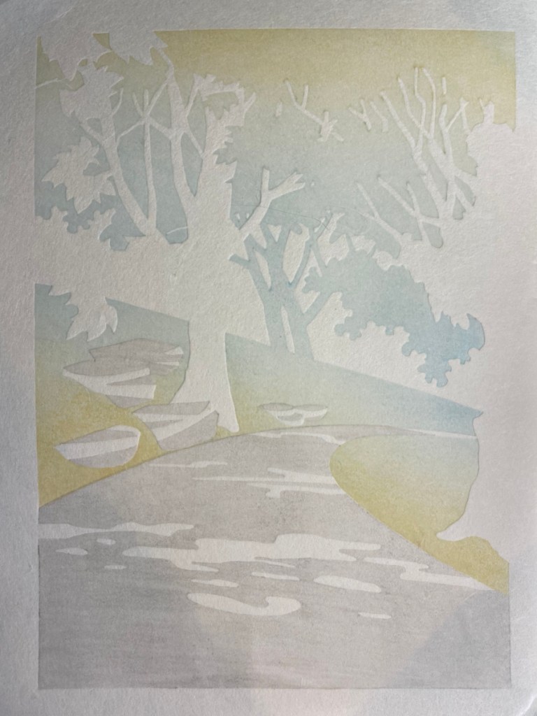
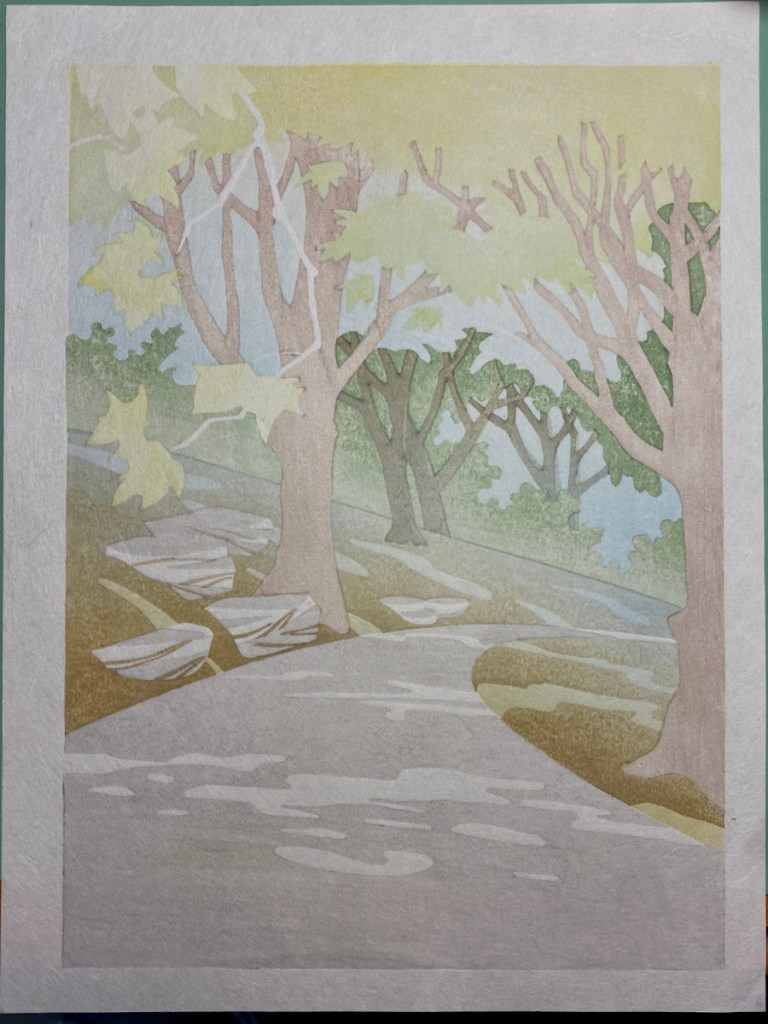
– The first three impressions used two blocks, one for the light gray, and the other to set up a weird gradient, where I have bluish in the middle and yellowish at each end. This used the block I had previously modified to remove the bright green leaves and tree bark, so that I could have some blue for the sky without affecting those areas.
– The 4th impression added a pale yellow green to most of the leaves at the top.
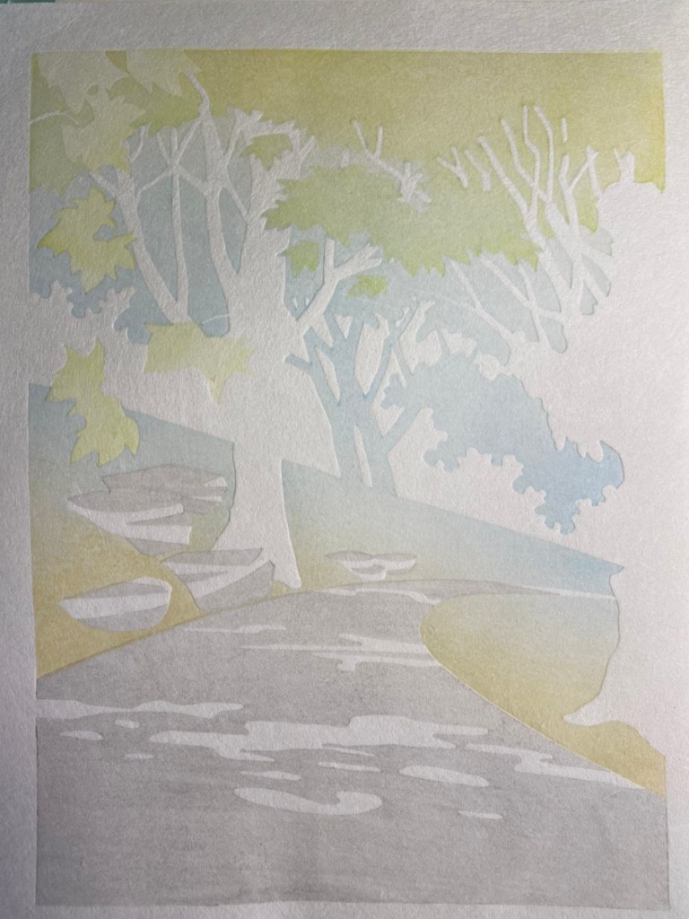
– You can see what the 5th added!
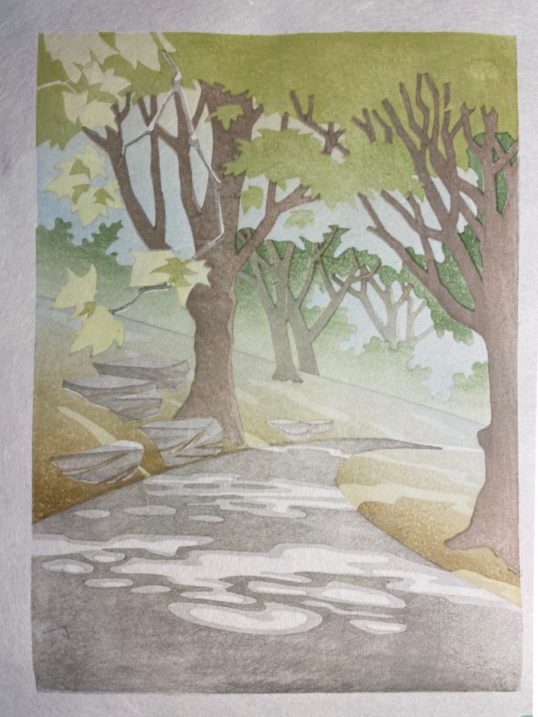
– 6 through 11 added brown on the tree bark, a bokashi with greenish brown to the ground, and separate bark and shadow colors to the tiny trees in the background.
– 12 made the upper leaves darker, 13 added darker but still dilute sumi to the road and also trees and rocks.
– 14 and 15 added a more intense bright yellow green to most of the leaves, and also some to the ground plane.
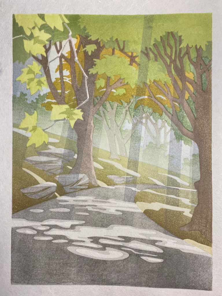
– Lots happened in the next 8 impressions! A medium green on the tree in the middle distance, darken ALL of the upper leaves, a dark gray bokashi mostly in the foreground, two blocks to add the shadows that bring out the light rays, MORE pigment on the upper leaves, another bokashi on the ground to deepen it, and finally the decision to try a crazy color on the middle tree.
– The 24th impression added more dark brown to the upper limbs and rightmost tree in a gradient.

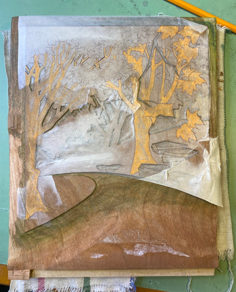
So why the new block? Well, when the pre-modification background block was printed all in yellow, these highlights on the mid-range trees looked ok. But if there’s “sky” in those areas, the highlights just look weird. I think they look weird anyway, and need more “leafy” texture. The new block will cover the whole area of that tree, and I can use it to make the highlights more like a yellow or at least olive. And I can modify the block that printed the gold color here to make the highlights more leafy.
So, I’m nearly there! Just the lines are left, and the new block of course. I’m happy with the use of a contrasting color for the middle trees, because they just looked vague and washed out previously. At this point I think I will dampen the REAL paper and start printing this weekend.