I’ve been busy, making progress on Forest Rays. Here is an animation showing the first 15 impressions.
It’s remarkably hard to do a good job at an animation like this. I tried to set the light up the same for each shot, but I was printing at different times of the day so there were some hard-to-avoid differences that are not solved by a simple white-balance. Also, to make them all the same size I had to stretch and shrink parts of each image to fit the same frame; some frames are stretched in places that others aren’t.
There are another 8 or so impressions to go, at minimum – better get back into the studio!
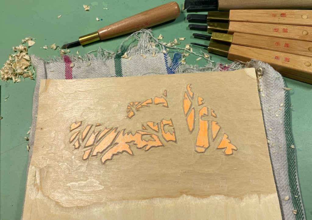
I’m nearing the end of this test printing and I think I’ve solved a problem that was bothering me – what to do with the trees that are in the middle distance. I’ll show you in a bit. But first, yes – I carved another block.
I just needed a little more color on those middle trees – this will be a bright color over their whole leaf surface, so that I can have some highlights more in line with the color the shadows will be. I’ll show you most of the stages of the test print so far.
The exposures are all a little different so the colors aren’t showing up exactly the same in each case, and it may be hard to see what changed.
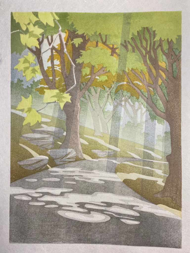
– The first three impressions used two blocks, one for the light gray, and the other to set up a weird gradient, where I have bluish in the middle and yellowish at each end. This used the block I had previously modified to remove the bright green leaves and tree bark, so that I could have some blue for the sky without affecting those areas. – The 4th impression added a pale yellow green to most of the leaves at the top. – You can see what the 5th added! – 6 through 11 added brown on the tree bark, a bokashi with greenish brown to the ground, and separate bark and shadow colors to the tiny trees in the background. – 12 made the upper leaves darker, 13 added darker but still dilute sumi to the road and also trees and rocks. – 14 and 15 added a more intense bright yellow green to most of the leaves, and also some to the ground plane. – Lots happened in the next 8 impressions! A medium green on the tree in the middle distance, darken ALL of the upper leaves, a dark gray bokashi mostly in the foreground, two blocks to add the shadows that bring out the light rays, MORE pigment on the upper leaves, another bokashi on the ground to deepen it, and finally the decision to try a crazy color on the middle tree. – The 24th impression added more dark brown to the upper limbs and rightmost tree in a gradient.
So why the new block? Well, when the pre-modification background block was printed all in yellow, these highlights on the mid-range trees looked ok. But if there’s “sky” in those areas, the highlights just look weird. I think they look weird anyway, and need more “leafy” texture. The new block will cover the whole area of that tree, and I can use it to make the highlights more like a yellow or at least olive. And I can modify the block that printed the gold color here to make the highlights more leafy.
So, I’m nearly there! Just the lines are left, and the new block of course. I’m happy with the use of a contrasting color for the middle trees, because they just looked vague and washed out previously. At this point I think I will dampen the REAL paper and start printing this weekend.
In the last post, I talked about removing the leaves that should be sunlit from the base color block, so that I could use it for a blue sky without having the sunlit leaves go dull. I decided also to remove the trunks and limbs of the trees from that block, so I could have more control over their final color. Here’s the plan:
Wow, gluing this transfer down onto an already carved block was a bit of a mess. Glue collected in the depressions and refused to spread where I wanted it. I ended up with a really rough paste job and no good peel at all, as you see on the left. But the registration seems to be good at least – it is lining up with the previously carved areas!
The one on the right is after the new areas have been carved and cleared. I had to be very thorough in washing it, and in scraping out the excess transfer glue with a toothpick.
Next, I’ll need to verify the registration of the new carving, but after that NO EXCUSES, time to start printing on real paper.
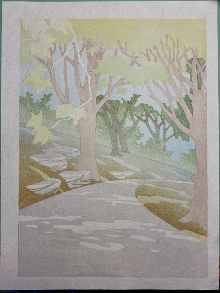
Well, I am on round 3 of test printing for the forest rays. I’ll mention a few highlights here.
I got the shadow blocks carved! Here they are, still with the hanshita remnants, and after cleaning them off below.
And I tested those shadows!
Test Round 1Test Round 2
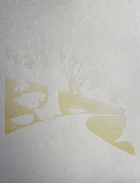
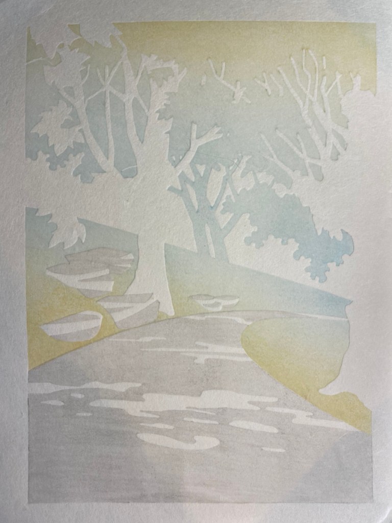
There were more test prints; above I show one example of the first two testing rounds. In the first, I used a creamy yellow as the base color for almost all but the road. This worked out well for the ground and the foreground leaves that are caught in sunlight, but the yellow as sky just doesn’t work. In the second, I used a blue base color, but I think that didn’t work out as well for the ground.
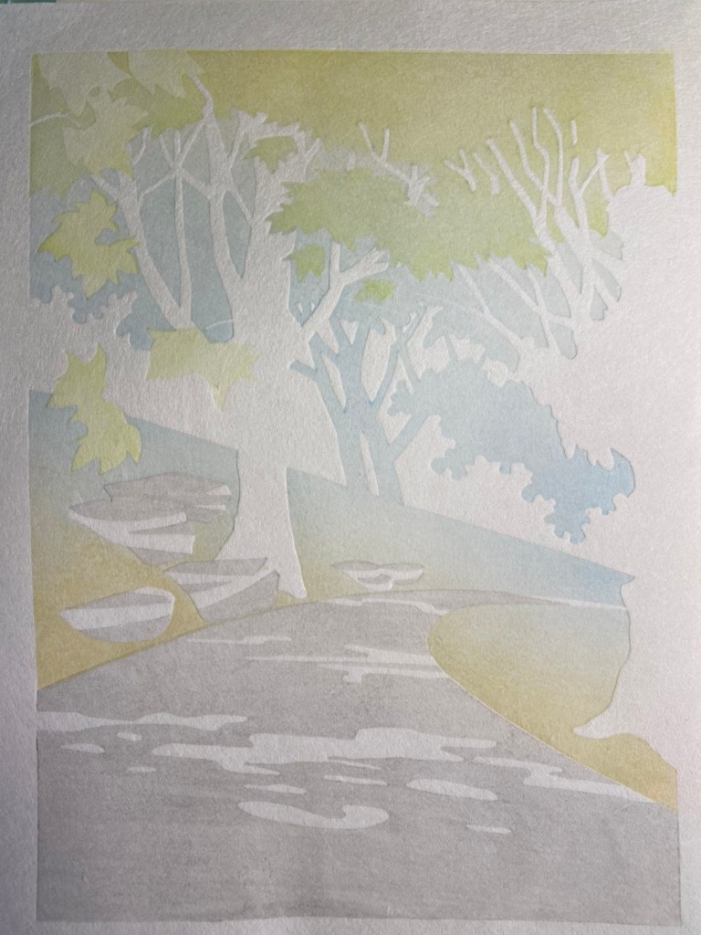
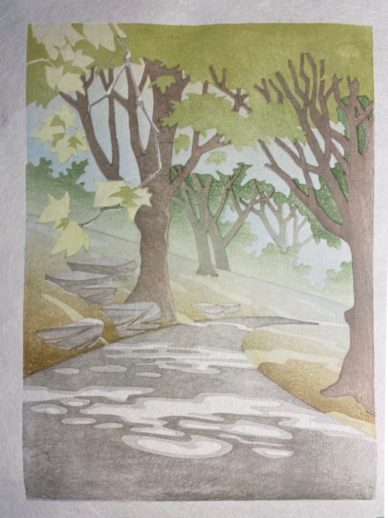
Next attempt involved using a couple of gradients on the base color; the left-hand image is early in the test printing process after using a creamy yellow gradient up, and a blue gradient down, plus the light gray on the road and rocks. The righthand image has all the impressions except for the key lines, going at top speed and not trying particularly hard to get an even impression – just trying to quickly get an understanding of how this approach might affect the final colors.
I like the way I was able to recapture some of the intensity and tonal variation in the ground while keeping the blue sky, but the sunlit leaves on the left really suffer. I think I will need to alter the base color block to carve away the sunlit leaves. Alternatively, or maybe in addition, I might isolate the bright green leaves on their own block (they are currently part of the next under-layer) so I can intensify them without affecting the rest.
When I made the plan for how to put the colors on the blocks, it seemed obvious that by rotating one of these 180 degrees, I could fit both of them on the same block:
It turns out it was not that straightforward! When I lined the two transfers up with a light board, to make sure they would both fit on the block without interfering with each other’s registration marks, I ended up with this situation. If I place one of the transfers at the position of the normal corner registration mark (red circle, upper left), the registration corner of the OTHER transfer sheet is hanging out in space (green circle, lower right). So without special provisions, I can’t fit them onto the same piece of cherry.
You can already see the solution (or part of it) in the image above. By gluing the cherry to a larger piece of plywood, and using small pieces of cherry strategically placed, I’m able to move the registration cuts out to locations that will let me place both colors on the same block:
The light gray for the rocks and road is now outlined and somewhat cleared. I am trying to make good use of the whole block, so the big space at the top will also get used. That is why I have the two corner registration slots that you see on the right.
The key lines for the trees and foliage in the background will go into this spot.
By placing the transfer sheet in the second, upper corner kento (circled), I can have those lines far enough away from the light gray color block region to avoid interference while printing.
One of the things that makes me scratch my head for a long time is, how do I do the color separations for a complex print? I’ve taken various approaches, including just starting to carve color blocks and keep adding them until I’m happy at one extreme, and planning them all out from the start and just going with it at the other extreme. The print I am working on now is the most complex so far, and I am being careful. I’m striving to make the best use of the wood, since if I don’t avoid it, I could end up using dozens of blocks. I also expect there will be many revisions to my plans along the way. Here’s how I have approached it so far.
First of all, I made a mockup in a drawing program that attempts to approximate the print. I used the same scan that I used for the keyblock transfer and floated it transparently on top, then made layered vector objects underneath that so I could easily change the fill or transparency, add gradations, change the boundaries etc.
With this, I could make some hypotheses about what colors I would need and how they would combine. I can’t really explain how I did that though! Just experience mixing colors I guess. (To those who are trying this at home: Don’t be paralyzed! Guess-and-test will get you there. Emphasis on the test! 🙂 )
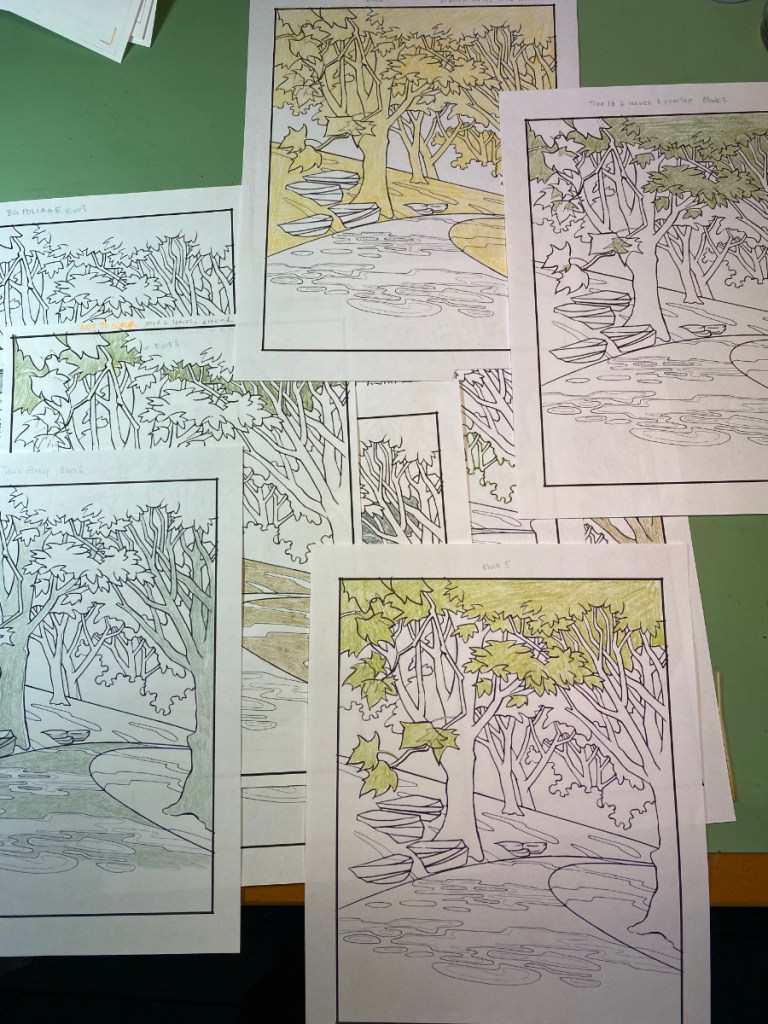
I made a list of the colors I thought would go on each area of the print, combining to make the colors I wanted to be there. Then I did the color testing I mentioned in the last post, overlaying regions of color with a brush to test out those hypotheses.
I made a table listing all the regions of the print as rows, with the pigment to be applied as columns. These are still just guess! Then I made a ton of printouts, and colored these with colored pencil to indicate the regions I thought would be color blocks. These sorts of steps help make sure that all of the regions of the print are considered, and that I don’t end up with a big white spot because I forgot to put color there.
I used these “coloring book pages” to figure out which color regions could be combined on the same piece of wood. Those two on the left can be clearly combined if I flip one of them 180 degrees, and if the wood is long enough and wide enough that the registration cuts don’t interfere.
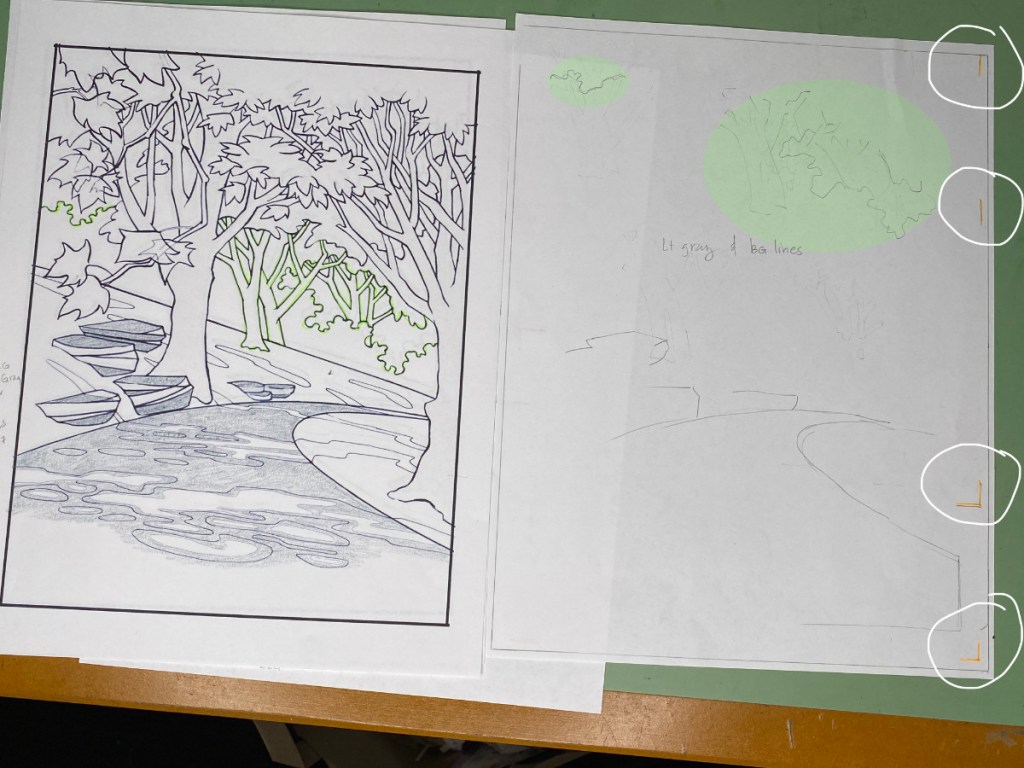
From when I initially made that table, I changed plans about the outlines of the trees in the distance. Not only the farthest trees, but the two at mid-distance, need to have lighter outlines than the main key lines of the image. On the right-hand image above, the pencil sketch on the right shows that I can put both the light gray of the roadway and rocks, and the key lines of the mid-distance and distance trees on the same block, if I use different sets of registration marks. On the “coloring book page”, the lines that are over-lined in green will go on the block where the light green blobs are on the right half of the shot; the gray of the road and rocks will go at the bottom. The white circles on the very right show the placement of the registration cuts – two corner cuts near the bottom, and straight cuts on the upper right.
I also decided I needed more subtle control over the fill and shading of the trees in the distance. That’s why I isolated each individual background tree twice on this last block. By placing the top two registration marks circled in orange, I can print the small tree where the upper yellow circle is; with the lower two orange-circled registration marks, the larger tree will print where the large yellow circle is. Flip that block around, and I can do the same thing again to print some shading for these trees where the green highlights are. The trick is to position the registration cuts so they won’t interfere with regions that will print.
In all, I think I can get away with 8 more blocks for the basic structure of this print; then I’ll need about three more for the special shadows that reveal the sunbeams.