Experiments!

Uncategorized

I’m doing a residency at Karuizawa Mokuhanga School and trying some different carving and printing methods. First of all, it’s a wonderful opportunity to focus as much as I want on printmaking – which is turning out to be most of my waking hours! There are others here working, so it’s a great environment to concentrate. If I was at home with this much free time I would no doubt be organizing my sock collection or some other such passtime of questionable value 😉

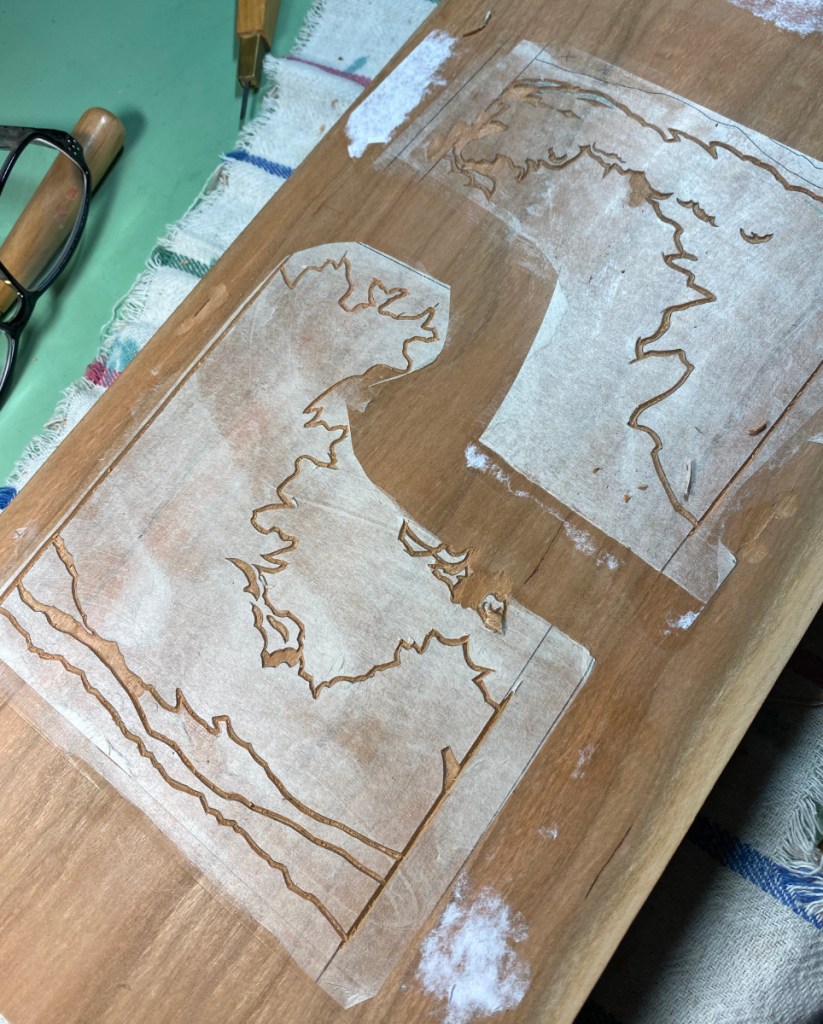
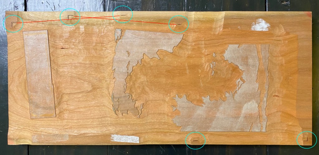
Often I’ll use the computer to print out a cleaned-up, precise set of transfer sheets for the key block and/or color blocks, and paste them down as a carving guide. This time I traced the key lines directly onto the block.

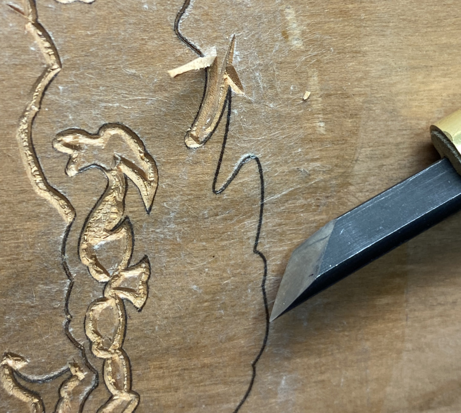
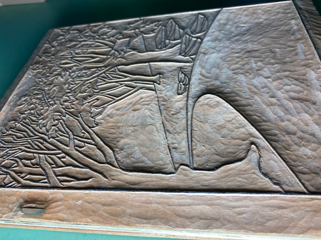
This block is magnolia wood, something I’ve never carved on before. It’s softer than cherry, but is able to hold a pretty good line. I expect it would not last as long as a cherry block, but since I don’t publish thousands of any design, that’s not such a huge consideration. (I do wonder what will happen to it when I get it home to 50% humidity conditions in Texas!)

When starting with a key block, I usually print the key lines on laminated transfer sheets, as in the first photo below showing transfer sheets (hanshita) for Cedar Path. Gampi is affixed to a more sturdy backing sheet with repositionable spray adhesive, printed with the key block, then pasted down to transfer the lines for carving. This time I printed the transfer sheets directly onto washi – Awagami kozo extra light – and will paste those down directly. With fingers crossed!

Another change from my normal practice:

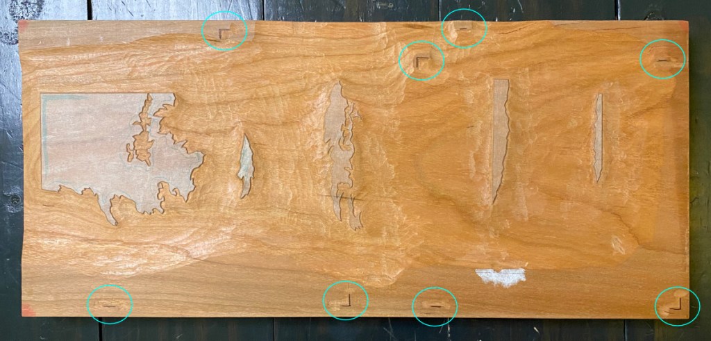
You’ll see the kento (registration marks) printed directly on the transfer sheets! This is because the transfer sheet is too light to place into registration marks on the color blocks.

Stay tuned for more experimental results!

Fitting it all on one block – again!

Uncategorized

My next project is now just about ready for test printing. I have a backlog of pictures to show various bits of the preparation.

I wanted to use a whole sheet of the Kitaro Kizuki without wasting any of it. This drove the paper size, which turned out to be 6-1/4″ x 8-3/4″ (about 160 x 220mm).

This will be a print without key lines. At first I thought I could use shina, but when I worked up the design (which will take 7 color regions), I realized that to get the shapes I wanted, shina would be risky – the top plies might come off of the smaller regions. So cherry it is; time to make a new block!

I cleaned up some aluminum scraps I found to help flatten the glue-up, scrubbing them with soap and water, filing the sharp edges, and checking to make sure there are no nicks or burrs that could damage the surface of the wood.

As usual, I used a card scraper to smooth the surface. I also wet-sanded with 1500 grit and made a final pass with the scraper.

So yes, as you might be wondering, that is a really long block! If I had made 2 double-sided blocks, I would not be able to fit all the color areas; by leaving it in one piece (8″ x 18″), I had more flexibility to position the registration marks and color areas so they would not interfere with each other.

Some carving progress:

Below are some straight shots showing the full blocks, with registration marks circled.

I tried to place the registration marks so that there would not be some weird bump in the middle of the paper that would result in unwanted embossing. The second mark in the top image IS in the middle of the paper for the shape that is approximately in the middle, but I think it is far enough away that I can avoid rubbing it. In the bottom image, two of the shapes are at a little bit of an angle. This places the potentially-interfering registration marks outside the edge of the paper (red lines).

Below are the cleared blocks tilted so they are lit at a low angle. This really emphasizes the texture, but it also shows that I am trying to carve deeply enough from the beginning so that I’m not doing so much cleanup when I get into printing.

That is it for now! Onward to the test-printing!

Shadows, and patch.

Uncategorized

I’ve planned some shadows for the foliage. While I was at it, I also planned some for the branches too! Here are the transfer sheets –

Carving on these new shadow blocks is all finished at this point. On the way, I encountered a little mistake, circled in orange in the upper left image below. The missing bit of wood is long gone, sadly – if I still had it, I might try to glue it on with waterproof glue, even though it is a really tiny piece. I decided to try this time to make a non-janky, properly installed repair. It is still a tiny tiny piece of wood! I cut a sliver of cherry about as wide as the missing part, then chopped it to be about 1/4″ long. I used my knife to hollow out a similarly-shaped hole in the block to hold it.

Just above on the left, it’s glued in, then on the right it’s been trimmed. It is not perfect, but I think it will work well to avoid a gap in the tree-shadows.

Almost ready to test it out

Uncategorized

I’ve left the grass until the last; it’s kind of complicated with all the overlapping and intersecting lines. It’s just my luck that the gampi didn’t stick as strongly in this corner, so I am having to be very careful about dragging the knife.

Still, I am seeing the light at the end of the tunnel! Only a few more hours, then I can clear the large waste and try it out.

Color block modification

Forest Rays

In the last post, I talked about removing the leaves that should be sunlit from the base color block, so that I could use it for a blue sky without having the sunlit leaves go dull. I decided also to remove the trunks and limbs of the trees from that block, so I could have more control over their final color. Here’s the plan:

Wow, gluing this transfer down onto an already carved block was a bit of a mess. Glue collected in the depressions and refused to spread where I wanted it. I ended up with a really rough paste job and no good peel at all, as you see on the left. But the registration seems to be good at least – it is lining up with the previously carved areas!

The one on the right is after the new areas have been carved and cleared. I had to be very thorough in washing it, and in scraping out the excess transfer glue with a toothpick.

Next, I’ll need to verify the registration of the new carving, but after that NO EXCUSES, time to start printing on real paper.

Still in the forest!

Forest Rays

Well, I am on round 3 of test printing for the forest rays. I’ll mention a few highlights here.

I got the shadow blocks carved! Here they are, still with the hanshita remnants, and after cleaning them off below.

And I tested those shadows!

There were more test prints; above I show one example of the first two testing rounds. In the first, I used a creamy yellow as the base color for almost all but the road. This worked out well for the ground and the foreground leaves that are caught in sunlight, but the yellow as sky just doesn’t work. In the second, I used a blue base color, but I think that didn’t work out as well for the ground.

Next attempt involved using a couple of gradients on the base color; the left-hand image is early in the test printing process after using a creamy yellow gradient up, and a blue gradient down, plus the light gray on the road and rocks. The righthand image has all the impressions except for the key lines, going at top speed and not trying particularly hard to get an even impression – just trying to quickly get an understanding of how this approach might affect the final colors.

I like the way I was able to recapture some of the intensity and tonal variation in the ground while keeping the blue sky, but the sunlit leaves on the left really suffer. I think I will need to alter the base color block to carve away the sunlit leaves. Alternatively, or maybe in addition, I might isolate the bright green leaves on their own block (they are currently part of the next under-layer) so I can intensify them without affecting the rest.

Fitting two impressions on a block

Forest Rays

When I made the plan for how to put the colors on the blocks, it seemed obvious that by rotating one of these 180 degrees, I could fit both of them on the same block:

It turns out it was not that straightforward! When I lined the two transfers up with a light board, to make sure they would both fit on the block without interfering with each other’s registration marks, I ended up with this situation. If I place one of the transfers at the position of the normal corner registration mark (red circle, upper left), the registration corner of the OTHER transfer sheet is hanging out in space (green circle, lower right). So without special provisions, I can’t fit them onto the same piece of cherry.

You can already see the solution (or part of it) in the image above. By gluing the cherry to a larger piece of plywood, and using small pieces of cherry strategically placed, I’m able to move the registration cuts out to locations that will let me place both colors on the same block:

And here are the two transfers, pasted down:

Color block carving underway

Forest Rays

The light gray for the rocks and road is now outlined and somewhat cleared. I am trying to make good use of the whole block, so the big space at the top will also get used. That is why I have the two corner registration slots that you see on the right.

The key lines for the trees and foliage in the background will go into this spot.

By placing the transfer sheet in the second, upper corner kento (circled), I can have those lines far enough away from the light gray color block region to avoid interference while printing.

All clear

Forest Rays

I’m now ready for the first test-printing of the key block for what I am calling “forest rays.”

This block took some time to carve! Carving is not my full-time job, and indeed I don’t think I spent more than 3 or 4 hours a day working on this block (and usually only an hour or so). I started on January 2, and now am (mostly!) done 3 weeks later. I say “mostly” because test printing will no doubt reveal that some adjustments are in order! Either I forgot to clear a spot, or there is a splinter sticking up, or I need to deepen some of the valleys because they are shallow enough to to let the paper touch, which would risk getting pigment in unwanted areas.

I included the “dramatic lighting” shot on the right to try to further illustrate how deep I’ve carved. The general rule is, the bigger the area of clear space, the deeper the valley needs to be. Paper won’t sag very deeply when the adjacent lines are close together.