Paper preparation

Uncategorized

Here’s the paper I will use for the current print. I’ve got 25 pieces of Kitaro’s Kizuki, and 5 pieces of a few other kinds I had lying around that I will use for testing. Because this is a really small print, I picked a sheet of the Kizuki that was on the thin side. It’s a completely handmade product, and there’s actually noticeable variation in the thickness.

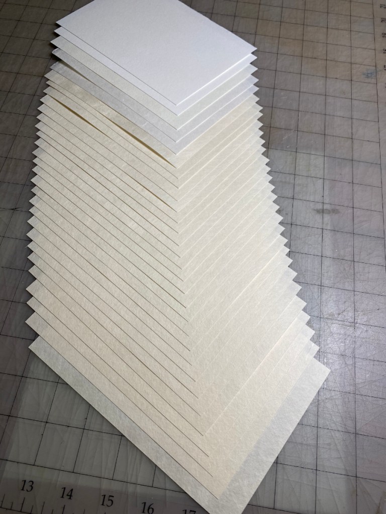
I’m applying a small dot of clear nail polish to one corner – the corner that will be inserted into the corner kento (registration notch) – of each piece of paper. This is a trick I learned from the printers at Mokuhankan. For a simple print with only one or two impressions it wouldn’t be that important, but reinforcing this corner prevents it from wearing and changing shape with repeated impressions. That way it’s possible to get precise registration every time.

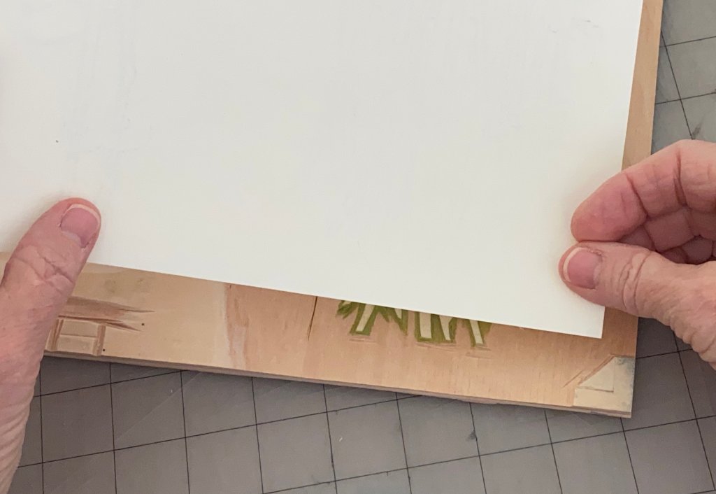
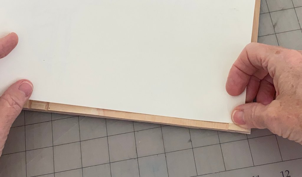
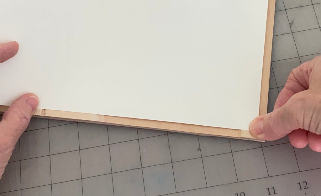
Here’s how the paper is placed when printing. I’m demonstrating with a block for a different print. First the corner is inserted into the corner notch on the right, then it’s placed against the little ledge on the bottom left, then laid flat on the block. It’s not necessary to reinforce the edge on the bottom left, but the corner can easily wear if it’s not strengthened!

Lazy person’s multiple key block

Uncategorized

I started the real run of prints on mulberry paper! I printed the entire key block first in light Payne’s gray, but wanted to darken the border and the lines on the rocks.

I think I’ve mentioned that the rock pile print might call for ‘mudabori’, or wasted carving. This is a technique where key lines are originally carved, then transferred to another block where they are carved to be printed in another color, and the original lines are carved away. It turns out I only removed a few of the lines from the lightest parts of the rocks in the foreground that will be taken care of by a block I will print in a light blue. But I did try one weird trick 🙂

Here’s what I did: I cut a piece of card stock, and used it as a mask.

Then, I did a second print run using a light sepia. To succeed, I needed to match the registration of the first impression exactly. I am pretty happy with the result! I only messed up the registration on one sheet of test paper.

Here’s one of the resulting washi sheets. Sorry about the low light, but you can probably see that the border and the rocks have lines darkened by the sepia, while the trees and distant shore still have fairly light lines.