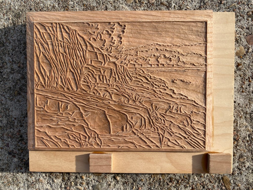
First, a tease –

Check out that nice embossing! But I’m getting way ahead of myself 😉
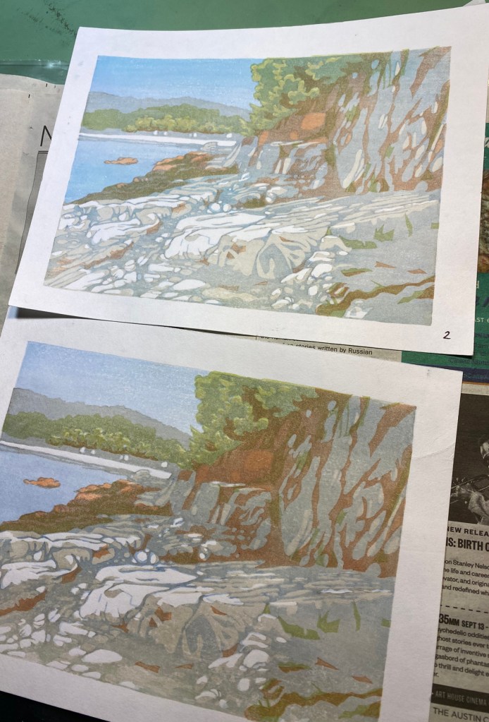
The 直島海岸 (Naoshima coast) print was finished awhile back. Here are some in-process images.

after first green impression 
after turquoise and brown 
after paynes on lower rocks 
green on just the trees 
after that 
everything drying! 
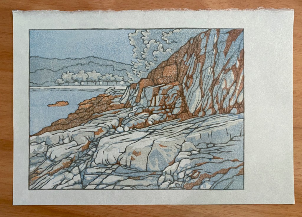
final print, including shadows on cliff face and on rocks by the shore
This paper was pretty difficult to work with because it is thick and rather rough. I have a lot of it; I will have to figure out how to make it work. On the plus side, it is really tough and stands up well to multiple impressions with vigorous baren work. And it is 100% kozo, and came to me sized. I should not be complaining! Next time I will try starting with a lot more water on the paper.