New print is ready: Katherine’s Mora River

rocks

My mom, Katherine Pittman, was a lifelong, working artist. When she found herself on her own in her 40s, that’s how she supported herself – painting, drawing, teaching, and doing calligraphy. At one point, she got a commission to make colorful maps of towns in Texas, drawing all of the businesses and their logos in pen and ink, and coloring them with watercolor. I think some organization of Chambers of Commerce footed the bill. Some time ago, I was in Kerrville and I spotted one of these she had drawn, on the wall in a barbecue joint!  There was no signature to prove it, but her hand was unmistakeable.

Her best works were beautiful, expertly-executed, realistic paintings, many in watercolor. 

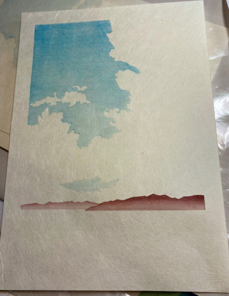
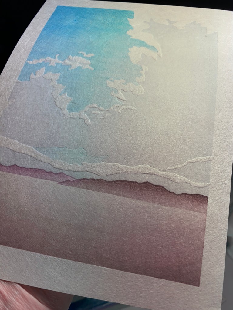
My new print is inspired by a watercolor sketch she did, in “false color”, of the Mora River in New Mexico. I think it was a sketch made on site. Since she is no longer around to give her input, I can’t really call it a collaboration, but I think she would approve! 

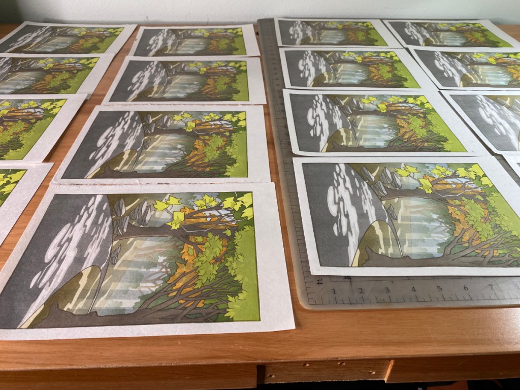
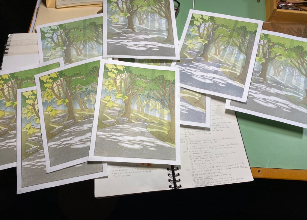
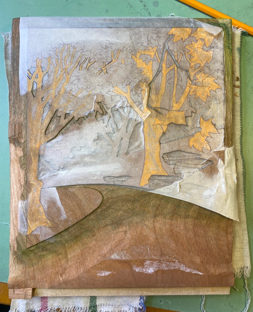
10 blocks, 16 layers, on Kitaro Kizuki (100% mulberry). If you are interested, get your copy here.

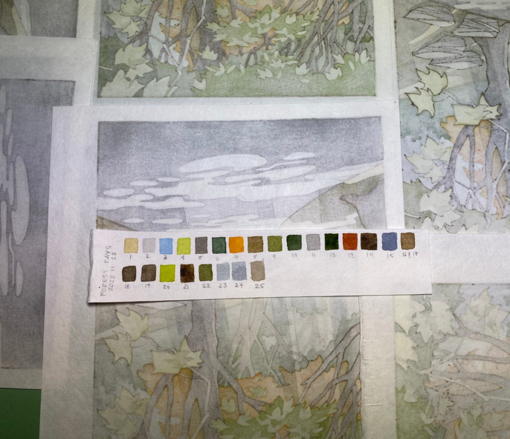
Here’s Katherine’s original watercolor sketch, probably on cold-pressed Arches (her fave) – just an unsigned sketch, not a finished painting. She did produce a finished piece, and if I can get a good photo I may post it later. It’s been hard for me to build up the saturated color in a block print that one can get from strong pigment and brush; something to work on.  And you can see I paid a lot of attention to the rocks in my version! I LOVE rocks 😉

Thank you Katherine! Miss you.

Forest Rays

Forest Rays

What did I do in 2022? I finally finished Forest Rays! At least I think I am done. The prints are still in the drying boards and will need a careful look-over before I add them to the store, but here’s a preview. I think I captured the feeling I was looking for – humid forest, light streaming through the branches, leaves caught in sunlight glowing brightly.

7 pieces of wood (6 self-made cherry ply and 1 shina ply from McClain’s), 19 printable areas including the key block, 25 impressions. (I had prepared separate key lines for the trees and foliage in the distance, but decided not to use them – that would have made 26 impressions!)

The paper is Shin Hosho from Woodlike Matsumura. When I started printing, I thought “Excellent, this paper is really tough, and I’ll need it for this print!” but by the end it was quite soft and barely hanging on. I had thrown in a few sheets of Student Kozo as warm-up sheets, but I gave up on them about 18 impressions in because they were fouling the blocks with fibers that kept coming off.

I’m looking forward to the next print! It will be a simple one, and I’ll aim to finish within a month – fingers crossed. Back to the carving bench!

15 impressions in!

Forest Rays

I’ve been busy, making progress on Forest Rays. Here is an animation showing the first 15 impressions.

It’s remarkably hard to do a good job at an animation like this. I tried to set the light up the same for each shot, but I was printing at different times of the day so there were some hard-to-avoid differences that are not solved by a simple white-balance. Also, to make them all the same size I had to stretch and shrink parts of each image to fit the same frame; some frames are stretched in places that others aren’t.

There are another 8 or so impressions to go, at minimum – better get back into the studio!

Test printing – brief report

Forest Rays

I’m in my 4th round of test printing for the Forest Rays project. It’s been a bit of a struggle, mostly because there are so many areas to print – 11 wood faces, 18 printable areas, 18 sets of registration marks, and lots of areas that overlap so they get printed multiple times.

I recently received some “Student Kozo” paper from Kitaro, and with some hope, am using it for this round of testing. Unfortunately it’s weak and floppy when damp, and seems to shrink and swell more than I’d like. And more frustrating for testing this particular print, when an area gets more than one or two impressions, fibers start to separate from the face of the paper; you can see that below.

I’m plowing forward despite the frustrations, and am succeeding at my aim to get more pigment onto the prints! Pretty soon though, I need to just take the plunge and actually print the things. I have a stack of Shin Hosho from Wood Like Matsumura set aside for this one; that paper is pretty tough!

I wonder if I might be able to add more sizing to this paper to toughen it up and be able to have less trouble testing prints that have lots of overlays. At any rate, it’s pretty nice for the price, so I can use it for simple prints without many overlapping colors.

Proofing paper, perhaps

Uncategorized

Or perhaps more than that, incoming from Japan!

It’s a roll of 10 sheets of the “student” 100% kozo (mulberry) paper from Kitaro. The top blue line says, 越前手漉き和紙、aka “Echizen tesuki washi”, or Echizen handmade Japanese paper. I’m looking forward to trying it out! It’s quite inexpensive for 100% mulberry paper. I’m not sure what makes it student grade – imperfections, maybe? I won’t really know until I plan some prints, take some out, and slice up a sheet for testing. From first inspection, it seems nice and sturdy, so hopefully the sizing is adequate. Who knows, maybe this paper will be worth more than testing material?

(Image credit to my friend Lou Hurlbut for the little print you can see on the wall!)

Planning new prints. Ahem. I’ve been stuck in that stage for awhile since I returned from Japan. I’ve got two ideas going – I will hint at them in cartoon form. These are purposefully low-res images because the designs are not final and a hi-res digital image just looks quite fake.

This one is taking lots of time to develop and I may not ever get there! But I love the idea.

This one is close! Obviously clouds are a recurring theme in these ideas. This was a real cloud that I saw in Junction, Texas. We wanted rain sooo bad! It was raining over there, 80 miles away where the cloud was, but not where we were. As the sun set, the colors just got more and more dramatic.

OK back to the studio!

Experiments!

Uncategorized

I’m doing a residency at Karuizawa Mokuhanga School and trying some different carving and printing methods. First of all, it’s a wonderful opportunity to focus as much as I want on printmaking – which is turning out to be most of my waking hours! There are others here working, so it’s a great environment to concentrate. If I was at home with this much free time I would no doubt be organizing my sock collection or some other such passtime of questionable value 😉

Often I’ll use the computer to print out a cleaned-up, precise set of transfer sheets for the key block and/or color blocks, and paste them down as a carving guide. This time I traced the key lines directly onto the block.

This block is magnolia wood, something I’ve never carved on before. It’s softer than cherry, but is able to hold a pretty good line. I expect it would not last as long as a cherry block, but since I don’t publish thousands of any design, that’s not such a huge consideration. (I do wonder what will happen to it when I get it home to 50% humidity conditions in Texas!)

When starting with a key block, I usually print the key lines on laminated transfer sheets, as in the first photo below showing transfer sheets (hanshita) for Cedar Path. Gampi is affixed to a more sturdy backing sheet with repositionable spray adhesive, printed with the key block, then pasted down to transfer the lines for carving. This time I printed the transfer sheets directly onto washi – Awagami kozo extra light – and will paste those down directly. With fingers crossed!

Another change from my normal practice:

You’ll see the kento (registration marks) printed directly on the transfer sheets! This is because the transfer sheet is too light to place into registration marks on the color blocks.

Stay tuned for more experimental results!

“Desert Cloud” is ready!

Uncategorized

You can find it here. I’m pleased with this one; it’s really simple, but the embossing and gradations turned out well.

I have a few printing progress shots:

After the 7th impression shown in the last photo, there were four more: a third gradation on the sky, two to build the medium shadows on the cloud, and one for the darkest cloud shadows.

I ended up with quite a stack of prints! However three were mistakes, and 5 had paper flaws that make them seconds. There were more bark fragments in these sheets than in the last sheets from this batch.