It’s a roll of 10 sheets of the “student” 100% kozo (mulberry) paper from Kitaro. The top blue line says, 越前手漉き和紙、aka “Echizen tesuki washi”, or Echizen handmade Japanese paper. I’m looking forward to trying it out! It’s quite inexpensive for 100% mulberry paper. I’m not sure what makes it student grade – imperfections, maybe? I won’t really know until I plan some prints, take some out, and slice up a sheet for testing. From first inspection, it seems nice and sturdy, so hopefully the sizing is adequate. Who knows, maybe this paper will be worth more than testing material?
(Image credit to my friend Lou Hurlbut for the little print you can see on the wall!)
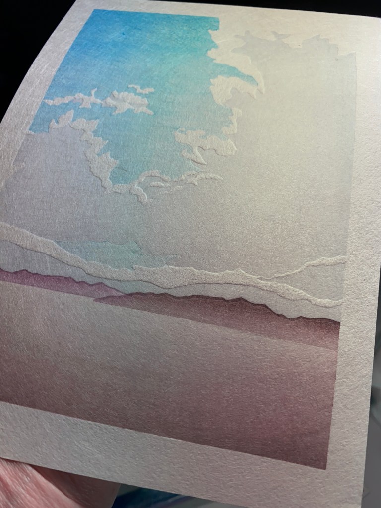
Planning new prints. Ahem. I’ve been stuck in that stage for awhile since I returned from Japan. I’ve got two ideas going – I will hint at them in cartoon form. These are purposefully low-res images because the designs are not final and a hi-res digital image just looks quite fake.
This one is taking lots of time to develop and I may not ever get there! But I love the idea.
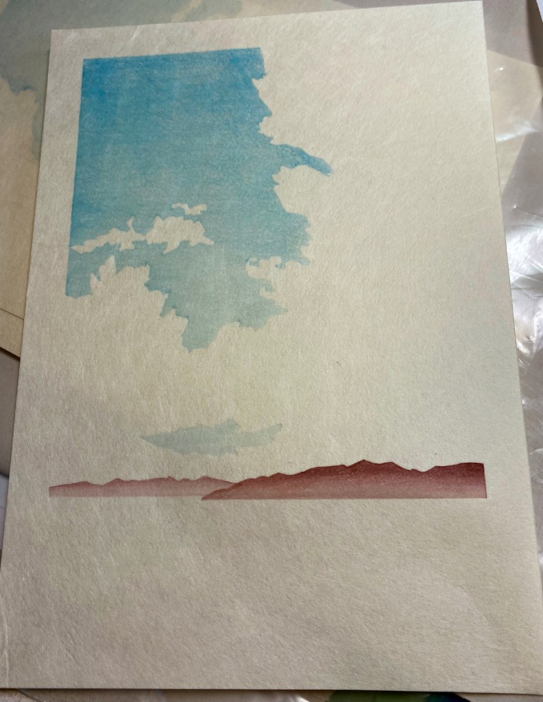
This one is close! Obviously clouds are a recurring theme in these ideas. This was a real cloud that I saw in Junction, Texas. We wanted rain sooo bad! It was raining over there, 80 miles away where the cloud was, but not where we were. As the sun set, the colors just got more and more dramatic.
I’m doing a residency at Karuizawa Mokuhanga School and trying some different carving and printing methods. First of all, it’s a wonderful opportunity to focus as much as I want on printmaking – which is turning out to be most of my waking hours! There are others here working, so it’s a great environment to concentrate. If I was at home with this much free time I would no doubt be organizing my sock collection or some other such passtime of questionable value 😉
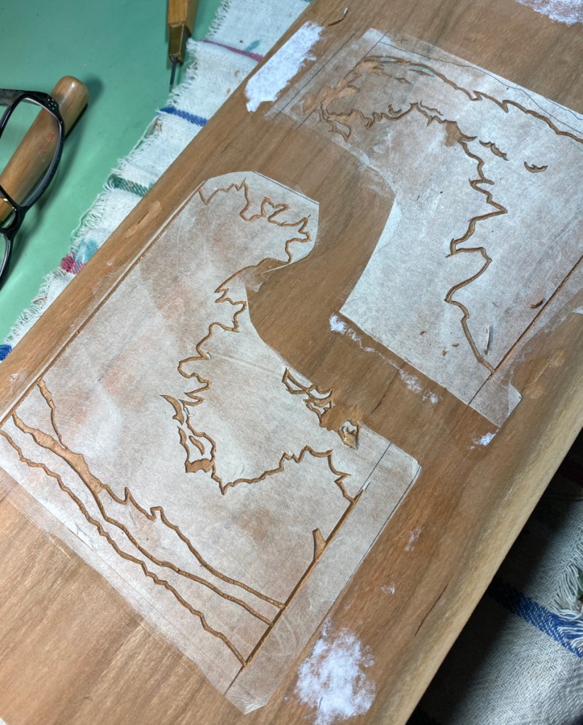
Often I’ll use the computer to print out a cleaned-up, precise set of transfer sheets for the key block and/or color blocks, and paste them down as a carving guide. This time I traced the key lines directly onto the block.
traced lines, midway through carvingall carved!
This block is magnolia wood, something I’ve never carved on before. It’s softer than cherry, but is able to hold a pretty good line. I expect it would not last as long as a cherry block, but since I don’t publish thousands of any design, that’s not such a huge consideration. (I do wonder what will happen to it when I get it home to 50% humidity conditions in Texas!)
When starting with a key block, I usually print the key lines on laminated transfer sheets, as in the first photo below showing transfer sheets (hanshita) for Cedar Path. Gampi is affixed to a more sturdy backing sheet with repositionable spray adhesive, printed with the key block, then pasted down to transfer the lines for carving. This time I printed the transfer sheets directly onto washi – Awagami kozo extra light – and will paste those down directly. With fingers crossed!
gampi transfer sheetsAwagami kozo extra lightblock with sumi
Another change from my normal practice:
You’ll see the kento (registration marks) printed directly on the transfer sheets! This is because the transfer sheet is too light to place into registration marks on the color blocks.
You can find it here. I’m pleased with this one; it’s really simple, but the embossing and gradations turned out well.
I have a few printing progress shots:
2nd impression3rd4th5th6th – another on the sky7th – cloud gradation
After the 7th impression shown in the last photo, there were four more: a third gradation on the sky, two to build the medium shadows on the cloud, and one for the darkest cloud shadows.
I ended up with quite a stack of prints! However three were mistakes, and 5 had paper flaws that make them seconds. There were more bark fragments in these sheets than in the last sheets from this batch.
My next project is now just about ready for test printing. I have a backlog of pictures to show various bits of the preparation.
I wanted to use a whole sheet of the Kitaro Kizuki without wasting any of it. This drove the paper size, which turned out to be 6-1/4″ x 8-3/4″ (about 160 x 220mm).
This will be a print without key lines. At first I thought I could use shina, but when I worked up the design (which will take 7 color regions), I realized that to get the shapes I wanted, shina would be risky – the top plies might come off of the smaller regions. So cherry it is; time to make a new block!
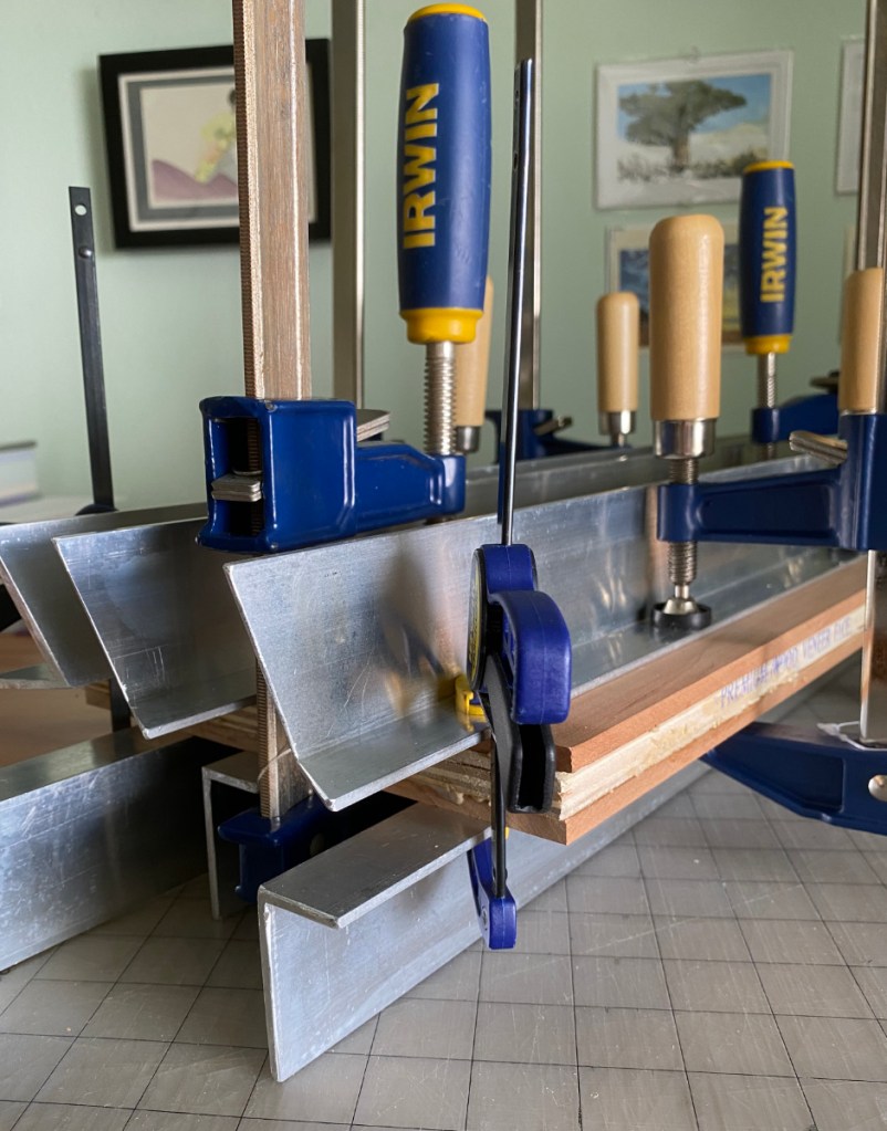
I cleaned up some aluminum scraps I found to help flatten the glue-up, scrubbing them with soap and water, filing the sharp edges, and checking to make sure there are no nicks or burrs that could damage the surface of the wood.
As usual, I used a card scraper to smooth the surface. I also wet-sanded with 1500 grit and made a final pass with the scraper.
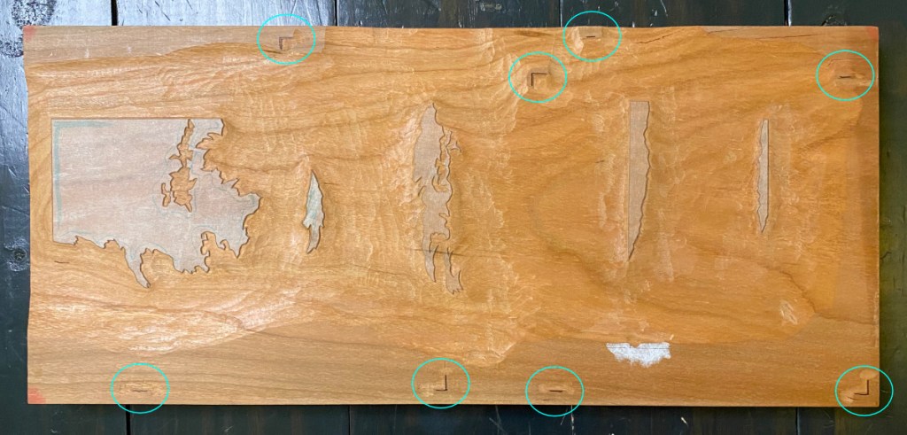
So yes, as you might be wondering, that is a really long block! If I had made 2 double-sided blocks, I would not be able to fit all the color areas; by leaving it in one piece (8″ x 18″), I had more flexibility to position the registration marks and color areas so they would not interfere with each other.
Some carving progress:
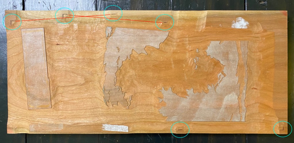
Below are some straight shots showing the full blocks, with registration marks circled.
I tried to place the registration marks so that there would not be some weird bump in the middle of the paper that would result in unwanted embossing. The second mark in the top image IS in the middle of the paper for the shape that is approximately in the middle, but I think it is far enough away that I can avoid rubbing it. In the bottom image, two of the shapes are at a little bit of an angle. This places the potentially-interfering registration marks outside the edge of the paper (red lines).
Below are the cleared blocks tilted so they are lit at a low angle. This really emphasizes the texture, but it also shows that I am trying to carve deeply enough from the beginning so that I’m not doing so much cleanup when I get into printing.
Although I originally imagined this print as done in monochrome – perhaps all in blue, in homage to the aizuri-e tradition – and even mocked it up in blue, I abandoned that plan pretty early in the test printing process.
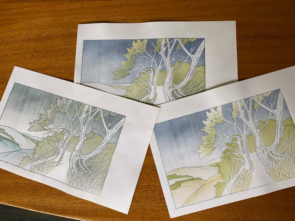
Here’s the final palette I landed on. I used a fair amount of sumi in the last few impressions! Number 14 was the key lines; the 15th was a bokashi to deepen the shadows on the bushes ahead.
I waited until near the end to print the key lines. Here’s what the print looked like just before, with impression 13 (grayish violet) as the most recent:
After adding the key lines and the deeper shadows, and drying –
I’m now wondering if I can pull off a sunset image with the same blocks! Hmm… might need more/different shadows.
I’ve planned some shadows for the foliage. While I was at it, I also planned some for the branches too! Here are the transfer sheets –
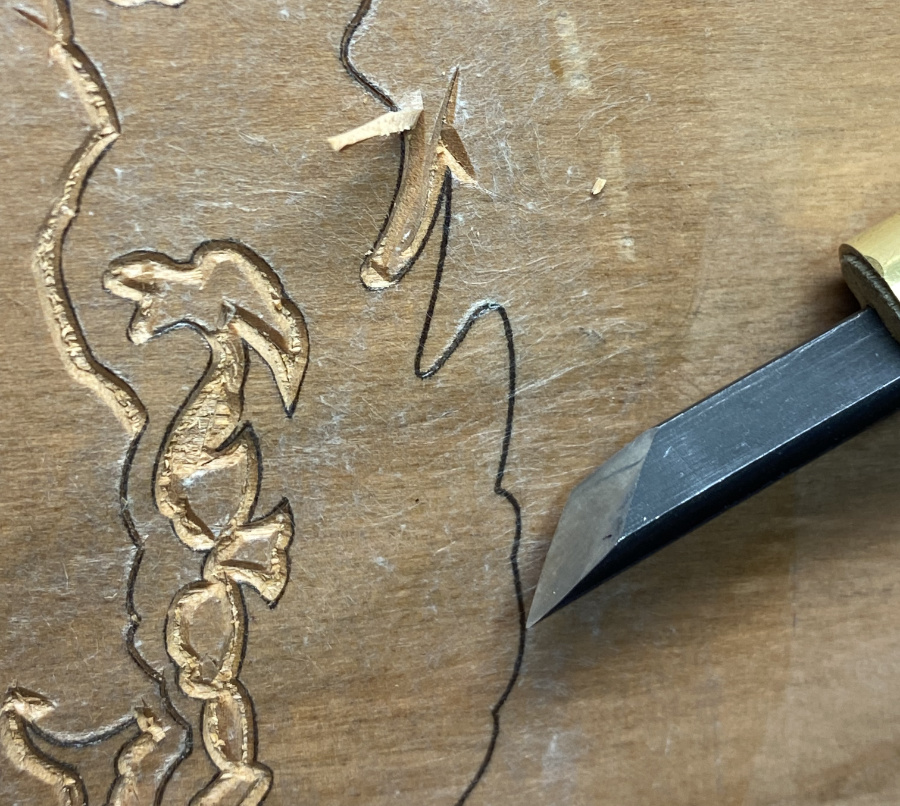
Carving on these new shadow blocks is all finished at this point. On the way, I encountered a little mistake, circled in orange in the upper left image below. The missing bit of wood is long gone, sadly – if I still had it, I might try to glue it on with waterproof glue, even though it is a really tiny piece. I decided to try this time to make a non-janky, properly installed repair. It is still a tiny tiny piece of wood! I cut a sliver of cherry about as wide as the missing part, then chopped it to be about 1/4″ long. I used my knife to hollow out a similarly-shaped hole in the block to hold it.
Just above on the left, it’s glued in, then on the right it’s been trimmed. It is not perfect, but I think it will work well to avoid a gap in the tree-shadows.
When I first conceived of this print, I imagined doing it all in monochrome, probably in Prussian blue. So I started doing test prints on card stock, and I tried having it damp like normal washi for printing, hoping that that would keep it from wrinkling so I could do multiple impressions. Right away I realized that the Prussian blue I was trying to use was NOT the right hue, so I printed over that pretty quickly with some Payne’s gray on the sky and some olive and Payne’s on the foliage. That’s the test on the left. Some of the Prussian blue is sort of preserved on the little hill on the far left – it was much more turquoise than I expected.
Another thing I noticed is just how much the card stock changes size with variation in moisture content! The leftmost try is registered pretty well because I did it all in one go and the paper did not dry much. But the others are horribly registered, especially on the right of the image, because these tiny pieces of paper shrank almost an eighth of an inch in width! Finally, something weird was going on with those vertical lines in the sky. Was it the paper or the block? I’m afraid it might be the block because it’s got some rough areas due to crazy grain in that area. I actually took a very fine, 1500 grit, piece of sandpaper to it, to try to reduce the roughness. I was really careful to avoid rounding the edges or hollowing out a hole. That seems to have helped a little – the top-most try was printed last of these three, and the lines seem less prominent. So I sanded a little more.
The next few test prints were done using Shin Torinoko, an economical Japanese paper that is sized, machine made, and with a fiber content of linen and pine pulp. It’s pretty different from what I will ultimately print on, but it is dimensionally stable and can take multiple impressions. I would really like to find a better paper for test-printing, but haven’t found one yet that is inexpensive enough, adequately sized, and tough.
Anyway, here I am really moving away from the monochrome idea! I like the brown key lines, as opposed to blue. I tested whether it would be better to have shadows in the valleys between the hills on the left of the image, or mist; I prefer the mist. I like the greenish hills of the upper right image better than the gold-ish ones on the left image. I’m trying to use a bokashi to add shadows to the foliage, and that sort of works for the trees, but given where I want the shadows in the background foliage, it’s hard to control.
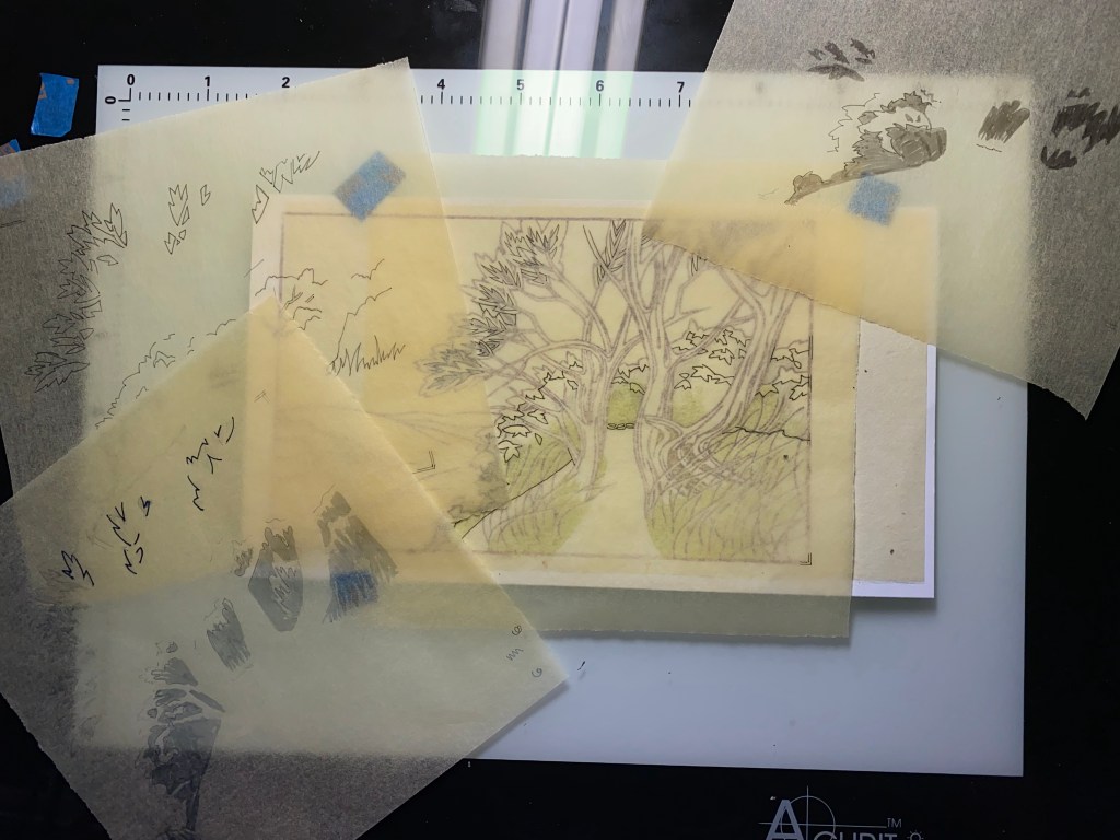
So, kicking and screaming a little (but not really, because it means I get to carve some more), I started thinking about another block to add shadows in a more controlled way. I made a few more transfer sheets and printed the key block. Because I didn’t make any key lines to delineate the path, but I really needed to know where its edge lay, I also printed that part on one of my transfers – that’s the green you see through the tracing paper below. I made a bunch of shadow sketches on tracing paper, before deciding how to approach it.
I can just barely see the outlines of the trace-paper shadow areas through the transfer sheet with the light table turned all the way up!
I think these areas will all go into the same impression (using a single set of registration marks).
So, getting closer to actually printing! The test prints are still damp, still in the freezer, and ready for testing the shadows when this next block is ready.
I’m sort of sad, because carving is my most favorite part! I’m all done with clearing the waste wood, and ready to start test printing – after I get rid of the remnants of the transfer sheets.
I’m trying to carve deeply where there are broad open areas, without carving too deeply in narrow areas, because that can trap paste and lead to blobs when printing. Apologies for the focus being a bit selective in the shots below, but this may give you an idea of how deeply I’ve carved.
I’m still not sure of the color scheme … I guess that will get figured out in the test prints! My original thought was monochrome-bluish, so I will begin that way and branch off as seems appropriate.
I’ll close with a Springtime picture. I must confess, this was last weekend, and the plum tree is pretty much done with its blooms by now and moving on into leafing out. There is still some Spring left though, and the bees are out in force!
Tada! There it is – two sides of the same hunk of wood.
Actually it did not take that much time to paste down all the transfers.
Those familiar with woodblock printing will notice a whole bunch of registration marks! 4 sets in the left picture, 3 sets on the right. So I’ll be doing MINIMUM 7 impressions (probably more), with ONE PIECE OF WOOD! I think I was able to place all of the pieces so that I have enough distance between color regions and registration marks to avoid unwanted pigment transfers.
In the right-hand image, the key lines are covered up by some copy paper that is taped on, to protect them while I am carving the color regions.