When I first conceived of this print, I imagined doing it all in monochrome, probably in Prussian blue. So I started doing test prints on card stock, and I tried having it damp like normal washi for printing, hoping that that would keep it from wrinkling so I could do multiple impressions. Right away I realized that the Prussian blue I was trying to use was NOT the right hue, so I printed over that pretty quickly with some Payne’s gray on the sky and some olive and Payne’s on the foliage. That’s the test on the left. Some of the Prussian blue is sort of preserved on the little hill on the far left – it was much more turquoise than I expected.
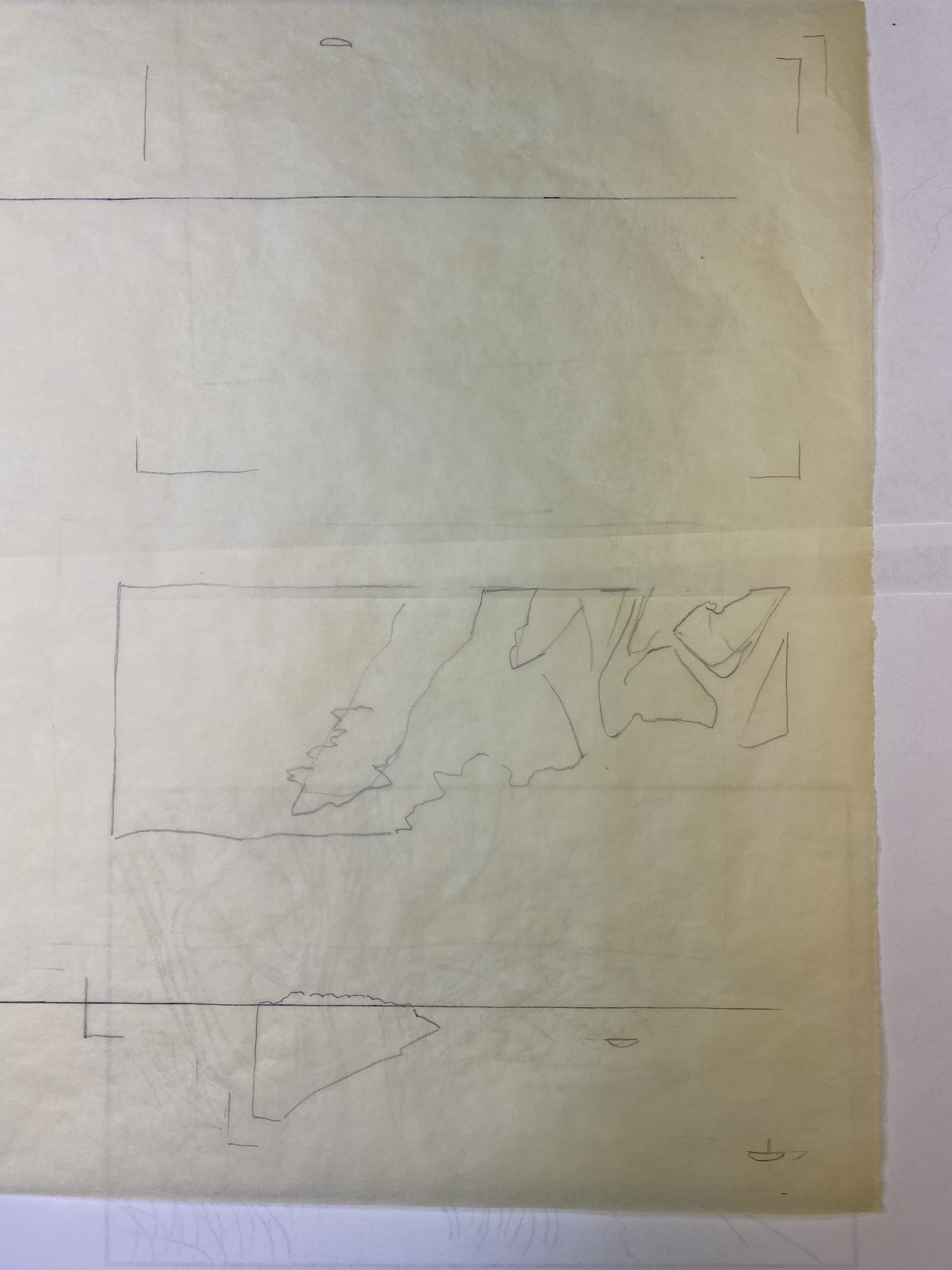
Another thing I noticed is just how much the card stock changes size with variation in moisture content! The leftmost try is registered pretty well because I did it all in one go and the paper did not dry much. But the others are horribly registered, especially on the right of the image, because these tiny pieces of paper shrank almost an eighth of an inch in width! Finally, something weird was going on with those vertical lines in the sky. Was it the paper or the block? I’m afraid it might be the block because it’s got some rough areas due to crazy grain in that area. I actually took a very fine, 1500 grit, piece of sandpaper to it, to try to reduce the roughness. I was really careful to avoid rounding the edges or hollowing out a hole. That seems to have helped a little – the top-most try was printed last of these three, and the lines seem less prominent. So I sanded a little more.
The next few test prints were done using Shin Torinoko, an economical Japanese paper that is sized, machine made, and with a fiber content of linen and pine pulp. It’s pretty different from what I will ultimately print on, but it is dimensionally stable and can take multiple impressions. I would really like to find a better paper for test-printing, but haven’t found one yet that is inexpensive enough, adequately sized, and tough.

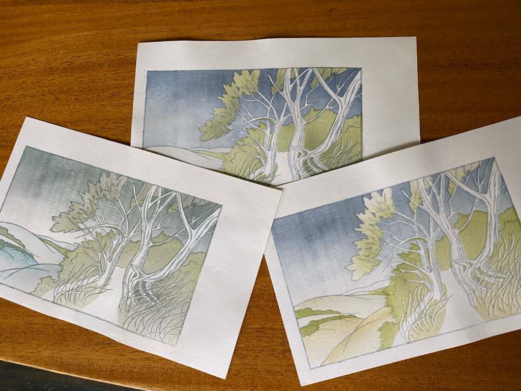
Anyway, here I am really moving away from the monochrome idea! I like the brown key lines, as opposed to blue. I tested whether it would be better to have shadows in the valleys between the hills on the left of the image, or mist; I prefer the mist. I like the greenish hills of the upper right image better than the gold-ish ones on the left image. I’m trying to use a bokashi to add shadows to the foliage, and that sort of works for the trees, but given where I want the shadows in the background foliage, it’s hard to control.
So, kicking and screaming a little (but not really, because it means I get to carve some more), I started thinking about another block to add shadows in a more controlled way. I made a few more transfer sheets and printed the key block. Because I didn’t make any key lines to delineate the path, but I really needed to know where its edge lay, I also printed that part on one of my transfers – that’s the green you see through the tracing paper below. I made a bunch of shadow sketches on tracing paper, before deciding how to approach it.
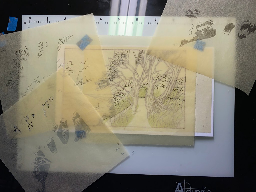
I can just barely see the outlines of the trace-paper shadow areas through the transfer sheet with the light table turned all the way up!

I think these areas will all go into the same impression (using a single set of registration marks).
So, getting closer to actually printing! The test prints are still damp, still in the freezer, and ready for testing the shadows when this next block is ready.