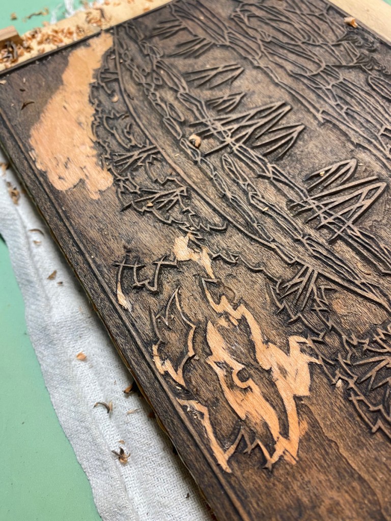
Getting pretty close to finishing the first block! The picture doesn’t show it, but there are some large areas that still need to be cleared. After that, I’ll do some testing/tweaking, and finalize plans for the color blocks.
I’m into a second small round of test printing on the Balcones Canyonlands print. This round is mostly focused on reproducibility, but I am also trying out a few variations.
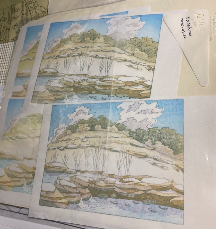
After 3 impressions – hill, sky, and water
Just one more – the basic rock color.
The first print on a block can be quite light, and then the color deepens over the next few impressions. I think I got the rock color a bit too dark on the bottom left one, in the image on the right.
After 6 impressions, including clouds and shadows on rocks/trees
5 or 6 more – general shadows, more tree pigment, rocks in the water, etc.
Not the best photos, but this gives you an idea how the colors combine.
I’m a bit unsatisfied about how dark the shadows are on the clouds in the final image, and am considering moving them to another block. Or really editing this one, or maybe just carving away the cloud part from the shadow block entirely.
One of the variations is the darker rock detail in the final image. The lower prints use a redder color for those areas than the upper prints do.
Another experiment was the pinkish cloud color. I went from a light egg-yolk-yellow on the first, adding a bit mor red as I went, to an almost pink with just a hint of orange on the fourth. I think the version I like the best is the second one, which is the image on the left above.
The final experiment is these leaves. I think I like them, and I think I like the darker ones
You can maybe see a bit of a registration issue with the shadows, which peek over the edge of the ledge in front of the stalks. The next thing I will do is test a correction; I’ve shaved down some thin pieces of scale lumber even thinner, and have tacked them in place on the registration marks to move the paper up a bit.
I went back to the place that inspired this image today. It’s the middle of July, after a couple of weeks of really hot days, many over 100 degrees F. There wasn’t a lot of water before, but now there’s only a trickle over the rocks, and the pool below is almost completely dry. I’m looking forward to some rain!
I’ve started testing the Balcones Canyonlands blocks. I’m trying a variety of pigments, in various combinations, to decide what to use for the final design. I don’t think I’ve gotten them right yet — for example, I think the base color of the hill should be something a little more gray. Also, these test prints are pretty rough, and are missing some impressions.
When I carved the clouds, I changed the shapes from the original sketch to make them rounder. I knew they wouldn’t look right with the key block outlines, as you can tell from the two test prints on top that I printed the key block on. So here goes, I’m removing them!
The next little round of tweaks will involve using a small part of one block that I left un-carved earlier to carve some faint shadows and outlines of rocks under the water. Here I have sketched them out:
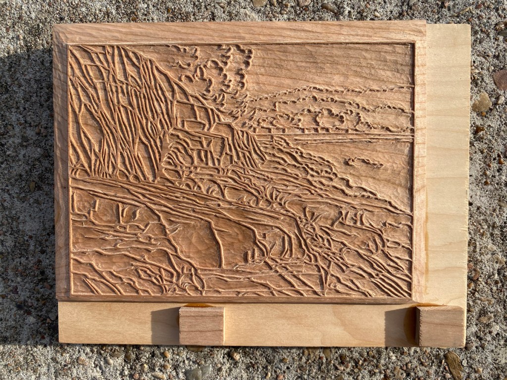
This is part of the one block I’m using that consists of 1/4″ American holly laminated on plywood. I decided to give holly a try because the wood seems very homogenous and the grain is inconspicuous. Plus, it is shrubby, and boxwood (used for very fine detail by some wood block carvers) is shrubby. It turns out the plants are not related at all (except that they are both Angiosperms…), and holly is only marginally harder than cherry (American holly: Janka 1020; American black cherry: Janka 950). Still, it cuts very smoothly and is not at all splintery. The main use of this block is the base color for the hill; even though I was hopeful holly would be good for carving detail, I didn’t want to rely on it straight away for that purpose and chose a large color region as its first trial. Carving these fine outlines and small shadows will let me test out whether it suffices for small details.
They are drying now, and the paper for the real deal is in the freezer. Other responsibilities delayed the start of the print run, but it will happen soon!
When I started working on the rockpile project, I wasn’t sure where the color would go, what blocks I would need, and so on. I drew and carved the key block, then thought about where the lightest colors would go and carved some color blocks for those, using transfer sheets printed from the key block to locate their edges. I started test-printing in earnest earlier this month, when I had blocks for light grayish, light bluish, green and reddish. First I tested some of the colors I though would be good to use, to see how they overlap and combine to make other hues. I kept notes and spots of color to document the saturation of the pigment I used to print.
After the initial testing, the results of which I showed in the last post, I decided to add some darker shading in some areas. Here are my transfer sheets:
Notice there is a thinner paper of the gampi type laminated on a thicker backing sheet. The lines were printed from the key block, then I marked and colored in the areas of the new blocks that are to remain. The blue is for water and sky shading; the yellow is to darken some areas of the rock, and the pink is for some even darker shadows on the rocks.
These transfer sheets get pasted UPSIDE DOWN on the new blocks using the same registration marks I’ll later use for printing, the thicker backing paper gets peeled off, and often part of the gampi gets peeled off along with it, leaving the face of the gampi with the lines and colors against the wood and visible through what’s left of the gampi. If it is still too thick, I can moisten it a little on one edge, and peel off another layer.
This block is one I’ve already test-printed from, but shows what the transferred gampi looks like after it’s pasted down and the excess is peeled off. It’s super-easy to see what to carve!
Here are my newest blocks after some test printing, and the two surviving test prints with their new shading.
I think it is starting to come together! I think I need a little more color on the trees on top of the hill, and more definition of the cliff face. I’ll see what I can do with my current blocks (there are 7!), but I might need to do more carving.
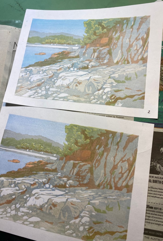
I’ve added another color, burnt sienna, to the two surviving test prints (there were three, but I made the boneheaded move of printing one upside down, of course) . Also the test on top has a bit of a turquoise bokashi that deserves its own block on the sky and water. I might have registration problems with the green; that is too be seen.
Next, I printed the key block lines in a light sumi on test #2.
Many of these lines are way too heavy, but this will let me see which I can trim down, which I can eliminate completely, and where I truly have registration issues. Progress!
It’s been awhile. I finished the Fall print, but not soon enough to send as a Fall card. We have a brand new year. And, I have made significant progress on a new print!
I finished carving the initial key block some time ago. There are lots of lines; it took awhile! Here is is before and after I cleaned off the transfer paper.
My hope for this print is that I can move in the direction of the subtlety and detail of some of the shin-hanga prints. This is an open question at this point! I think it is possible that many of the lines of this block may get replaced later by lines on other blocks, and so be carved away. (This is called “mudabori”, or “wasted carving.”)
Here’s an early test print showing the key block lines and a light shading block, printed using neutral tint.
Today I started trying out colors! I’m printing without the key block lines at first, to see which areas work well without them.
One more test print adding some green:
I have one more already-carved block that will add a reddish-brown color. Then I will think about what other blocks are needed, what needs to be trimmed, etc. This one will be long in the making, but I think it will be worth it!