Finishing touches, and onward to the next print!

Uncategorized

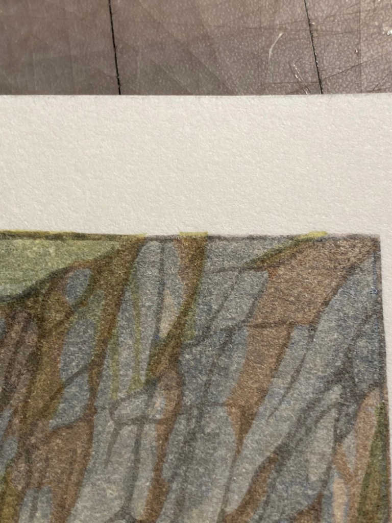
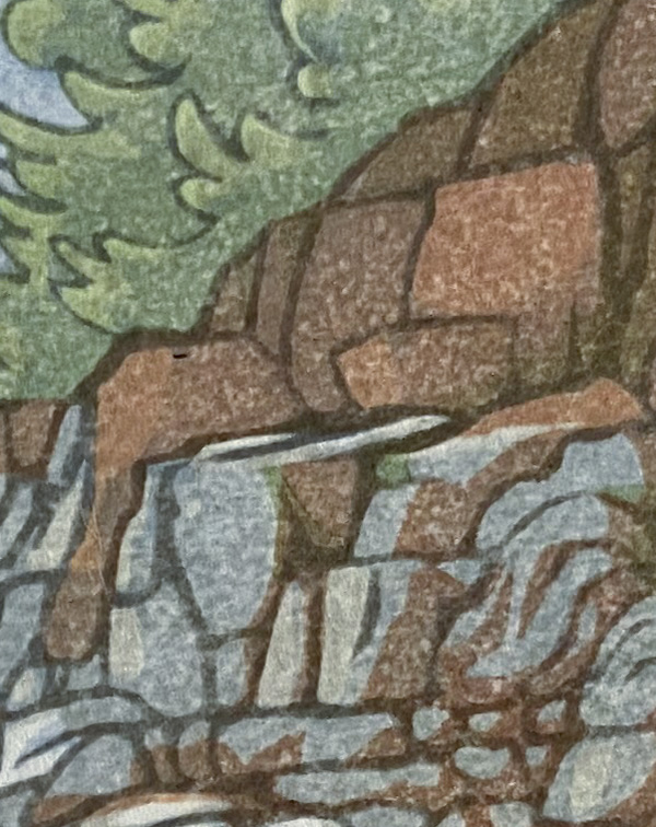
Despite being careful, wiping the edges while printing and shielding the registration marks with a little piece of brass sheet or a spoon (yeah that works pretty well too!), sometimes the white border around a print gets a stray mark of pigment like the image on the left.

What happened on the right? Not an eraser and not white out! I used my knife to fix this little mistake. The knife has to be really sharp, especially on this Echizen Kozo paper, which is really fluffy. I’ve heard that on some paper, a little sandpaper might remove spots like this but not on this paper (I tried) – it just raises the fibers and makes it look fuzzy. Instead, a very shallow slice on either side –

— and the spot is banished! I learned this (and got the bravery to try it) from watching Dave Bull on his Twitch live stream. Thanks Dave!

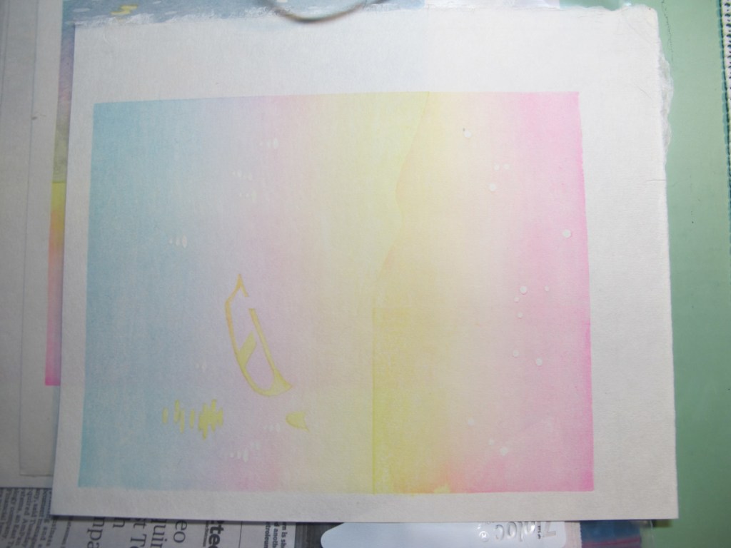
Alright, Light Show reprint #2 is completely done, time to move on. I’ve been working on a design based on some scenery from a recent socially-distanced hike I went on with some friends in the Balcones Canyonlands Preserve northwest of Austin. We drove separately, did not hug or get anywhere near close enough to, but it was good to be able to talk in person – 10 feet away! – to human beings I know and love.

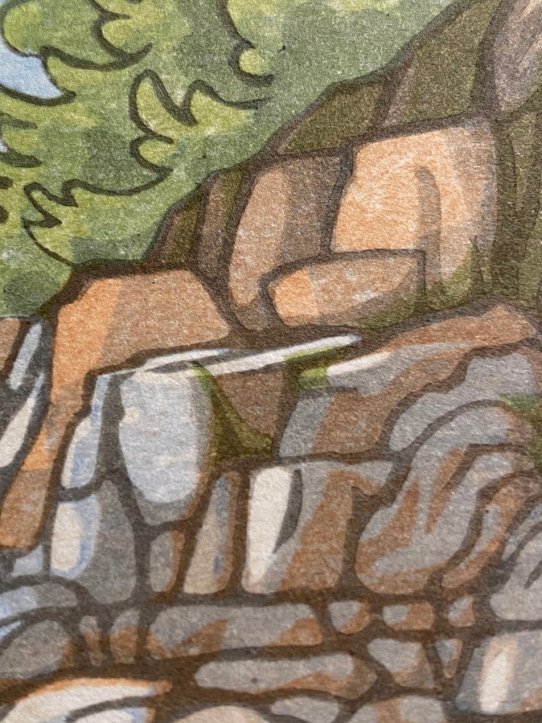
It was a lovely day, early Spring and still cool, and up the hill from this sweet little stream and pool was a hill strewn with rocks and crowned by trees. Once home, I commenced to sketching. My ultimate design is only loosely based on these images, is fairly stylized, and really focuses on rocks. (I love rocks!)

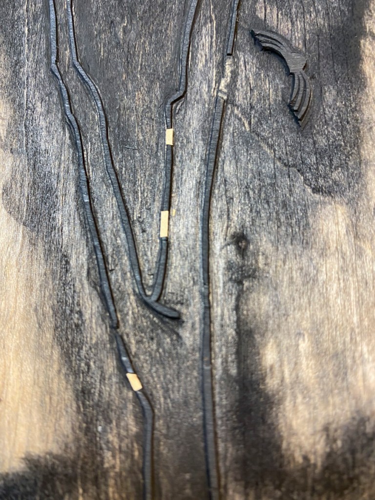
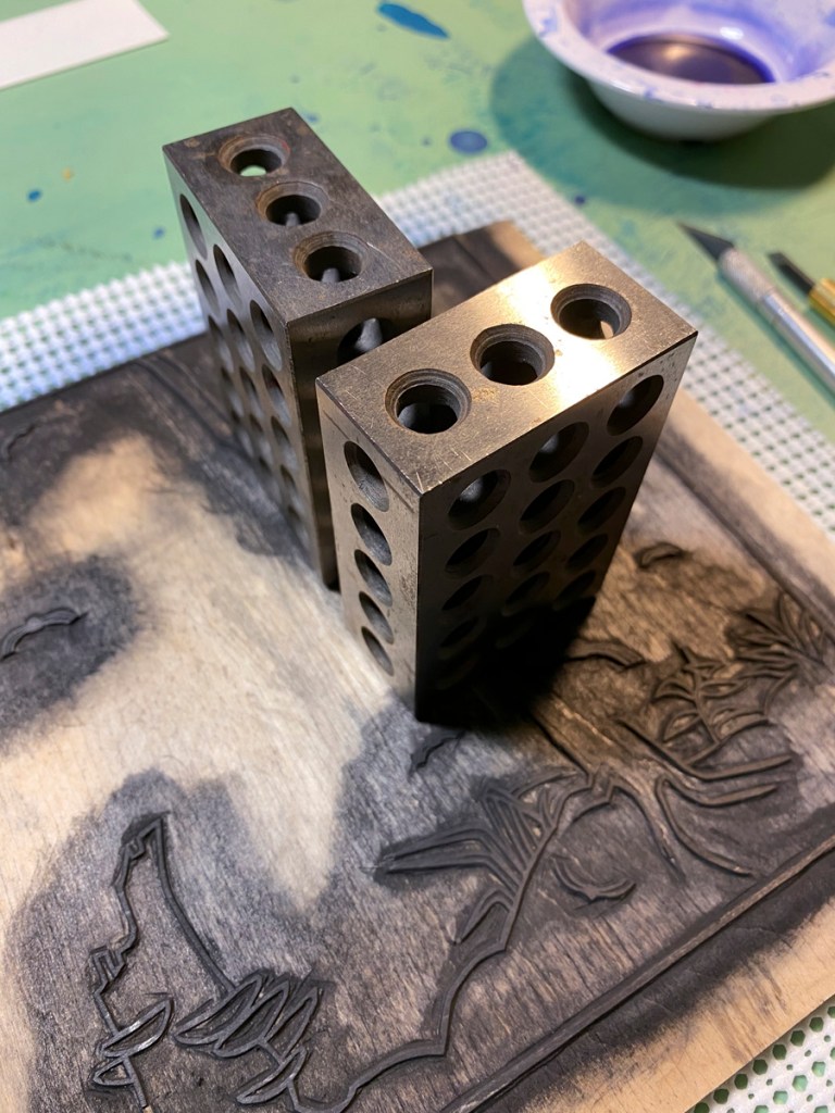
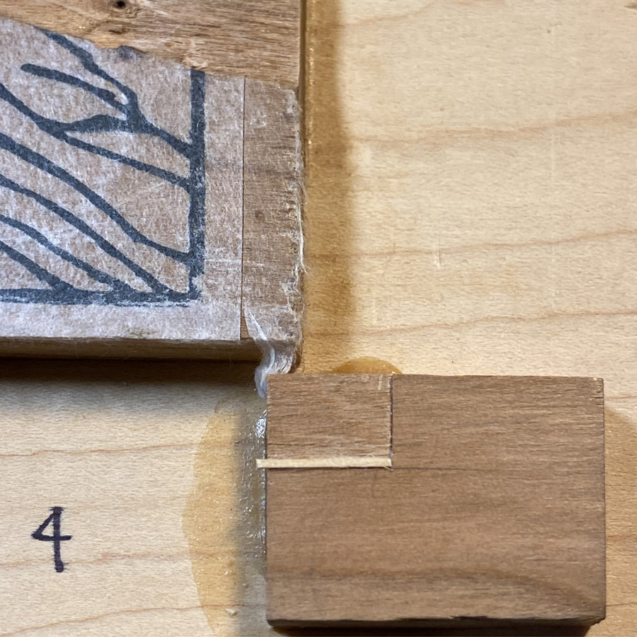
But before I can make another print, I need woodblocks. I have enough cherry thin lumber to make three printing surfaces that are about 6″ x 8″, and some holly that I got as an experiment to see if it might be sort of like boxwood, plus some plywood to laminate it too, and some odds and ends to paste on for registration marks, so they can be outside the 6″ x 8″ image region. That about exhausts the supplies I have lying around! After glueing and clamping —

— I now have two double-sided blocks, with three cherry faces and one holly. I have no idea how the holly will work. It seems very homogenous and free of grain, but it might be lying to me!

I also have some Shina ply, which I suppose I could use for color blocks if I can’t get anything better in time.

Here I’ve started on the line work.

Next: planning for which paper to use, and how to cut it to avoid waste. Then I can properly size the line work, and make a transfer sheet, paste it down, and start carving! Woohoo!

Short Tuesday note

Uncategorized

I had planned to print last night, applying maybe the last impression – the dark lines with sumi – on the fireflies, but when I looked at the block, I saw that some lines were missing. Blasted shina plywood again! You can see pretty clearly below that I filled in some places where the top ply went missing. Before printing, I’ll need to let the glue cure and then trim the patches to match the lines they are patching.

I’ve learned before that I need to let the glue cure really well before trying to use a block I’ve repaired this way. The next time I’ll have a chunk of time for printing is Thursday. There are 25 sheets in my stack – 19 of them on the Echizen Kozo – and it has been taking me about 3 hours to get through the stack, clean up my tools, and get the paper packed for the freezer, and I have that kind of time only 4 days a week.

I hope everyone is staying safe out there, and thanks for reading!

“Light Show” reprint

Uncategorized

As my tease from the last post might have suggested, I’m reprinting the fireflies. I’ve got my colors lined up:

… and I’ve done some repairs on the blocks. One of the hazards of Shina Plywood is that the top ply is pretty thin, and has a tendency to slough off, especially if you try to make a thin line across the grain.

Luckily, the thickness of this top ply is about the same as some micro-lumber I happened to have lying around. I was able to glue it down with waterproof glue for an almost seamless repair. In the left image, you see a repair I printed with — but while printing, another piece came off!!! *sigh*. On the right, a repair I hadn’t trimmed yet. It needs to be trimmed down to match the line, and also there are some areas where I need deepen the trough so I don’t get unwanted pigment spots.

In other stories of printing woes, the beginning of the end:

The takenogawa (“skin of bamboo”) doesn’t last forever. This one is on a murasaki baren I purchased in July last year. I’ve been good about rotating the cover, and using camelia oil, but it’s developing holes. It’s hanging in for the time being, but eventually I will have to bite the bullet and learn how to re-cover it.

I will leave you with another pleasantly embossed image, and evidence of further progress!

Fun with registration

Uncategorized

Looking back at my test prints, I see there are some registration problems with the green block. In the left image, there is green that sticks up too far, onto the top of a rock that should be mostly white. And on the right, there are some areas of green that extend past the border.

To address this, I used some micro-lumber (HO scale 2×4, I believe) I had laying around from a previous life as an architecture student. I tacked it in lightly with water-soluble glue, in case it didn’t work out.

Wellll, this did not work out so well. I don’t have a picture, but in the test after that, it was clear that not only was this change in the kento not enough to fix the problems, it introduced problems elsewhere — a margin of unprinted area just beneath many of the lines that delineate green areas like the trees.

So, the registration needed to be fixed with a knife. This was more successful!

“By Starlight” printing complete

Uncategorized

I finished the batch of boatmen! They are already at Mokuhankan in Tokyo, also available online here: https://mokuhankan.com/catalogue/KP02.php.

Here are my printing notes.

  1. Maimeri Blu Primary yellow: boat, lamp and sky bokashi. Block 1.
  2. 3-way bokashi on the water (live dangerously!): Primary yellow, Holbein Opera, Holbein Prussian Blue. Used a big shoe brush. Sheds like a dog, but it’s a good way to get a big brush on the cheap. Block 2.
  3. Holbein Opera bokashi on the sky, rim of the boat. Block 1.
  4. Grumbacher Academy Payne’s Gray, round bokashi on water. Block 3. This one has the water sparkles cut out. Used the big shoe brush again; brush marks visible on most copies.
  5. Grumbacher Payne’s gray: sky bokashi. Block 4. This one has the clouds cut out.
  6. Grumbacher Payne’s gray on Block 5, which has the boat interior, the shade of the boat, the man, and the hills and their reflection.
  7. Windsor Newton Indanthrene Blue: Block 3 (water sparkles)
  8. Indanthrene bokashi on Block 4 (sky)
  9. GB Payne’s Gray, round bokashi on water. Block 3 (water sparkles). This time I used two brushes rather than the big shoe brush, to try to smooth out the brush marks.
  10. GB Payne’s Gray on Block 6. This one has the darkest shadows on the water, the shaded side of the boat with its gear and pilot, and the above-water parts of the hills. I omitted the hills.
  11. GB Payne’s Gray roundish bokashi on the sky, block 4. Small hill was omitted.
  12. GB Payne’s Gray bokashi on the small hill, block 4.
  13. GB Payne’s Gray bokashi on the tall hills and their reflection (block 5)
  14. GB Payne’s Gray again on block 6, darker in the corner (omitted hills).

I am hereby appointed the ambassador for Grumbacher Academy Payne’s Gray 🙂

I took only a couple of process shots. The first is after impression 3, and the second is after impression 4.

If I were to carve these blocks again, I would try to think of a way to avoid the hard line at the horizon. It’s not just a matter of merging blocks 1 and 2, because the strong yellow on the rim of the boat and the lamp and its reflection need to be independent of the water blocks. But probably dividing responsibilities among the blocks differently could yield a more harmonious horizon.

Frankenblocks

Uncategorized

So awhile back, I ordered some cherry “thin lumber” from Ocooch hardwoods to experiment with making laminated blocks for carving. I got three pieces of 6″ x 24″, quarter inch thick Black Cherry. The pieces I got are nice looking, no or miniscule imperfections, and flat-sawn. Not wanting to commit to a big print right away, I chopped one of the boards into six approximately 4-inch wide pieces, and grabbed some baltic birch ply from the garage to use as a base. When I glued them up, this is what resulted (on one side; the back side looks similar):

Then I commenced to designin’. Dang, 3.8 x 5.9 is pretty small, and when I take away registration marks and a margin from two of the sides, it gets even smaller. So I thought maybe I could paste on some extra wood to hold the registration cuts. But then it was unsupported, and so that it wouldn’t break off, I pasted on some supporting pieces of basswood under those. Here is the result:

Everything is glued with Titebond III, waterproof and outdoor-rated — except the layers of the plywood. So I can’t submerse the whole thing. But hopefully, the kento extensions will remain stable throughout carving and printing.

Sneak peak

Yesterday I finished the key block design but wasn’t ready to move forward until the blocks were ready. I got all the Frankenblocks and all their prosthetics glued today, and did the key block transfer:

… and started carving:

I think I mentioned this already, but this is American black cherry. It seems to me to be harder than the Japanese mountain cherry I was able to use for the heron project. However, it is kind of fibrous. It will be interesting to see whether the fine lines I am trying to execute in this design will turn out ok. So far, at least, it seems better than shina in that I don’t have to be so paranoid about knocking off the top of a line.