It’s been awhile! I was derailed a bit by the deep freeze we suffered in mid-February. Here’s what it looked like before it got messed up. Really beautiful, but really cold without any heat!
I kept carving through it all, but got out of the habit of updating here. I’ll try to fill in the details!
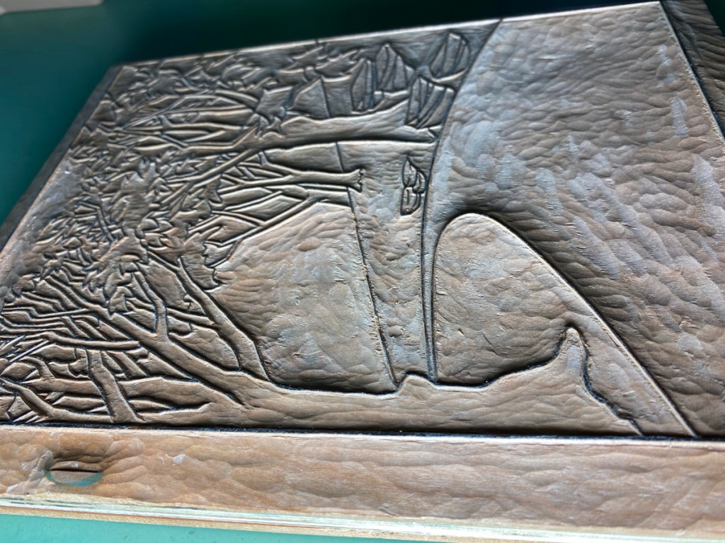
In the last post, I was showing how I used a second kento (registration slot) to separate the line block for the little trees and background foliage from the light gray block for colors that will show on the road and rocks. Here’s what it looks like pasted down and part of it carved.
I need these little lines for some of the other color blocks! But I didn’t use them right away, and plowed ahead with other color block carving. Below, the rightmost block is for dark grey. The one on the left has two corner kentos (see the lower left), and will be used for two colors – a shadow greenish color for the ground, and a lighter greenish color for some foliage.
There’s more to catch up on, but I will leave that for another post.
The light gray for the rocks and road is now outlined and somewhat cleared. I am trying to make good use of the whole block, so the big space at the top will also get used. That is why I have the two corner registration slots that you see on the right.
The key lines for the trees and foliage in the background will go into this spot.
By placing the transfer sheet in the second, upper corner kento (circled), I can have those lines far enough away from the light gray color block region to avoid interference while printing.
One of the things that makes me scratch my head for a long time is, how do I do the color separations for a complex print? I’ve taken various approaches, including just starting to carve color blocks and keep adding them until I’m happy at one extreme, and planning them all out from the start and just going with it at the other extreme. The print I am working on now is the most complex so far, and I am being careful. I’m striving to make the best use of the wood, since if I don’t avoid it, I could end up using dozens of blocks. I also expect there will be many revisions to my plans along the way. Here’s how I have approached it so far.
First of all, I made a mockup in a drawing program that attempts to approximate the print. I used the same scan that I used for the keyblock transfer and floated it transparently on top, then made layered vector objects underneath that so I could easily change the fill or transparency, add gradations, change the boundaries etc.
With this, I could make some hypotheses about what colors I would need and how they would combine. I can’t really explain how I did that though! Just experience mixing colors I guess. (To those who are trying this at home: Don’t be paralyzed! Guess-and-test will get you there. Emphasis on the test! 🙂 )
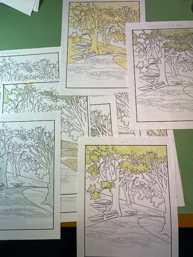
I made a list of the colors I thought would go on each area of the print, combining to make the colors I wanted to be there. Then I did the color testing I mentioned in the last post, overlaying regions of color with a brush to test out those hypotheses.
I made a table listing all the regions of the print as rows, with the pigment to be applied as columns. These are still just guess! Then I made a ton of printouts, and colored these with colored pencil to indicate the regions I thought would be color blocks. These sorts of steps help make sure that all of the regions of the print are considered, and that I don’t end up with a big white spot because I forgot to put color there.
I used these “coloring book pages” to figure out which color regions could be combined on the same piece of wood. Those two on the left can be clearly combined if I flip one of them 180 degrees, and if the wood is long enough and wide enough that the registration cuts don’t interfere.
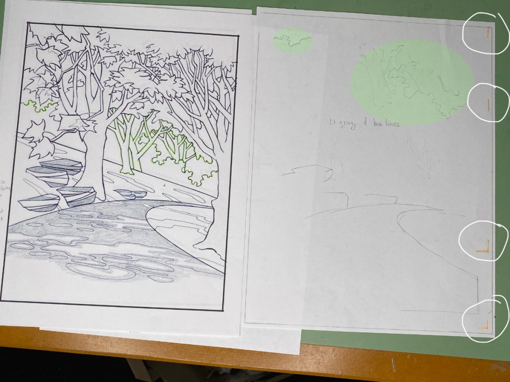
From when I initially made that table, I changed plans about the outlines of the trees in the distance. Not only the farthest trees, but the two at mid-distance, need to have lighter outlines than the main key lines of the image. On the right-hand image above, the pencil sketch on the right shows that I can put both the light gray of the roadway and rocks, and the key lines of the mid-distance and distance trees on the same block, if I use different sets of registration marks. On the “coloring book page”, the lines that are over-lined in green will go on the block where the light green blobs are on the right half of the shot; the gray of the road and rocks will go at the bottom. The white circles on the very right show the placement of the registration cuts – two corner cuts near the bottom, and straight cuts on the upper right.
I also decided I needed more subtle control over the fill and shading of the trees in the distance. That’s why I isolated each individual background tree twice on this last block. By placing the top two registration marks circled in orange, I can print the small tree where the upper yellow circle is; with the lower two orange-circled registration marks, the larger tree will print where the large yellow circle is. Flip that block around, and I can do the same thing again to print some shading for these trees where the green highlights are. The trick is to position the registration cuts so they won’t interfere with regions that will print.
In all, I think I can get away with 8 more blocks for the basic structure of this print; then I’ll need about three more for the special shadows that reveal the sunbeams.
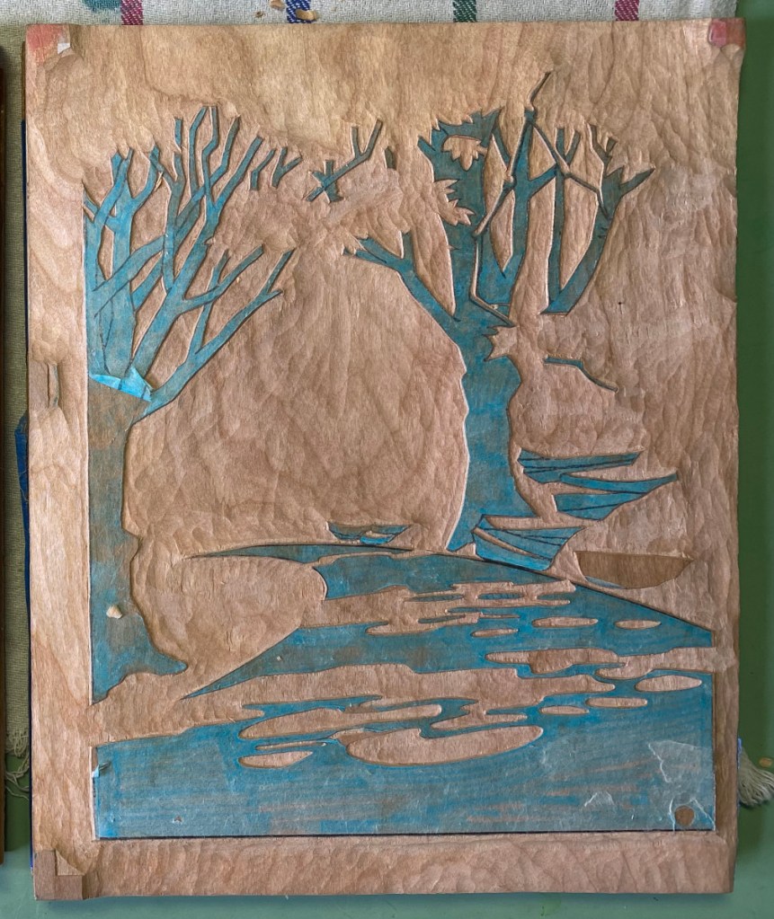
I’m now ready for the first test-printing of the key block for what I am calling “forest rays.”
This block took some time to carve! Carving is not my full-time job, and indeed I don’t think I spent more than 3 or 4 hours a day working on this block (and usually only an hour or so). I started on January 2, and now am (mostly!) done 3 weeks later. I say “mostly” because test printing will no doubt reveal that some adjustments are in order! Either I forgot to clear a spot, or there is a splinter sticking up, or I need to deepen some of the valleys because they are shallow enough to to let the paper touch, which would risk getting pigment in unwanted areas.
I included the “dramatic lighting” shot on the right to try to further illustrate how deep I’ve carved. The general rule is, the bigger the area of clear space, the deeper the valley needs to be. Paper won’t sag very deeply when the adjacent lines are close together.
Getting pretty close to finishing the first block! The picture doesn’t show it, but there are some large areas that still need to be cleared. After that, I’ll do some testing/tweaking, and finalize plans for the color blocks.
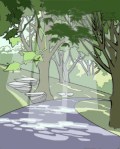
It took me awhile – about a month! – to work out the design for my next print. Here’s a little cartoon preview; the final print probably won’t look anything like this, but I hope to capture the same (or better and more mystical!) mood. I’m satisfied enough, though, to move forward with drawing and cutting key lines.
The path was long – I started with a pencil sketch, then imported into a drawing program and did a few vector versions so I could test out color/shading variations, then traced a couple of times before being happy with the lines. Above is the finished line work, and how it appears after transferring to the block, plus the first day’s carving.
There are lots of lines here! Some of them are not going to be part of the key block, but will be saved as other transfer sheets that I will use later when I carve color blocks for regions that won’t have outlines, such as the areas of light and shadow on the path.