Block 8 test – rock ripples, cliff shading. The next test round will be a little different, but I think all the elements are there.


Block 8 test – rock ripples, cliff shading. The next test round will be a little different, but I think all the elements are there.
It’s definitely Spring here. I have a Mexican Plum in front that is COMPLETELY covered in blooms.
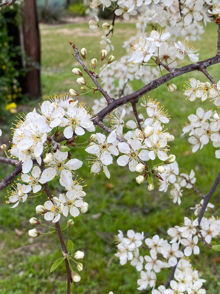
They really aren’t any good to eat, sadly, but I think the birds like them.
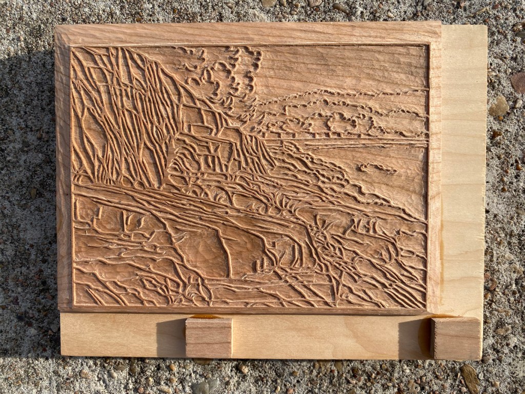
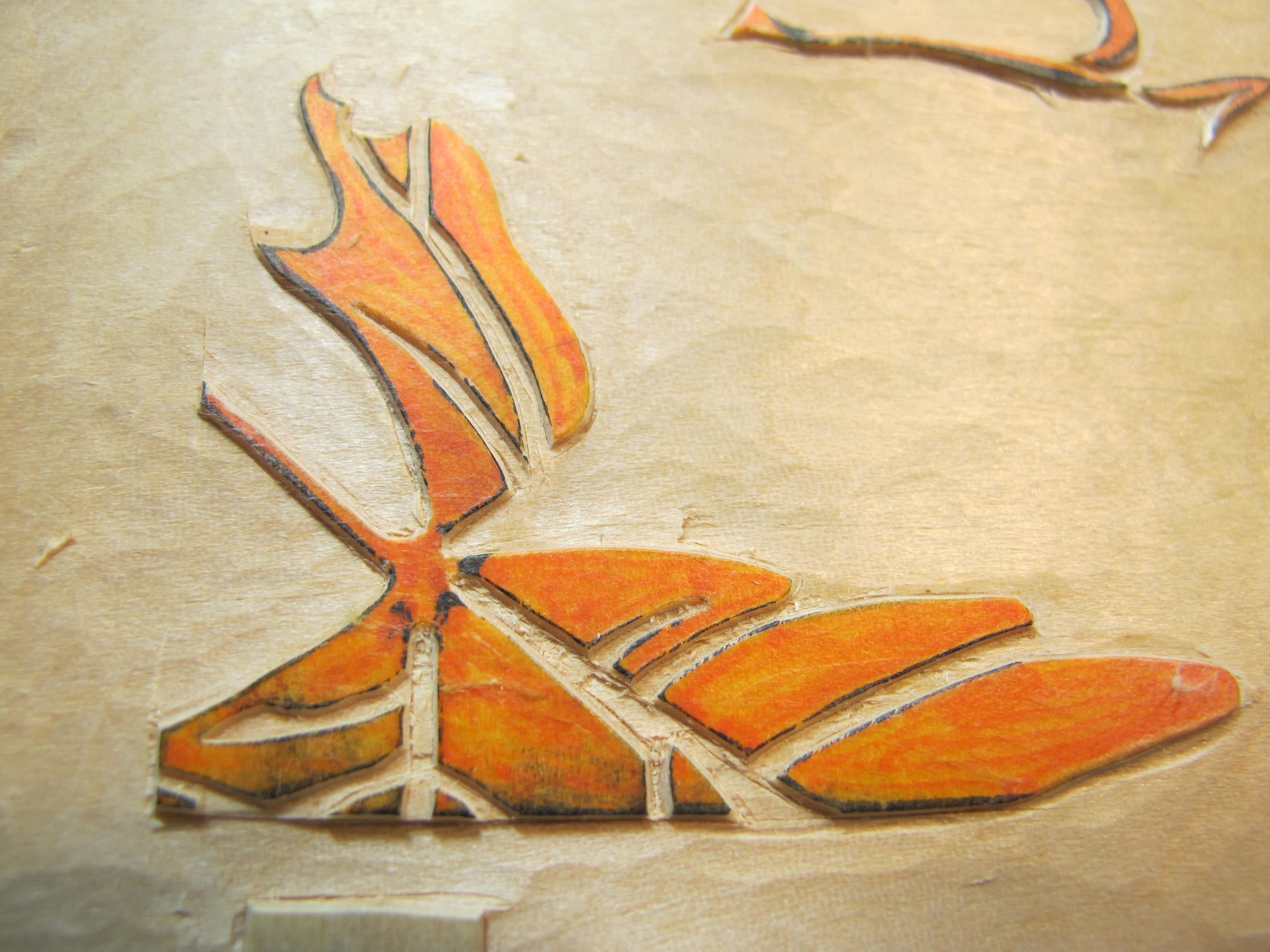
I’ve finished carving the final, I hope, block for the rockpile print. It’s not quite done in this shot. Chisels are 1mm and 3mm, for scale.

More test printing soon, then hopefully can start printing in earnest this weekend! Stay tuned.
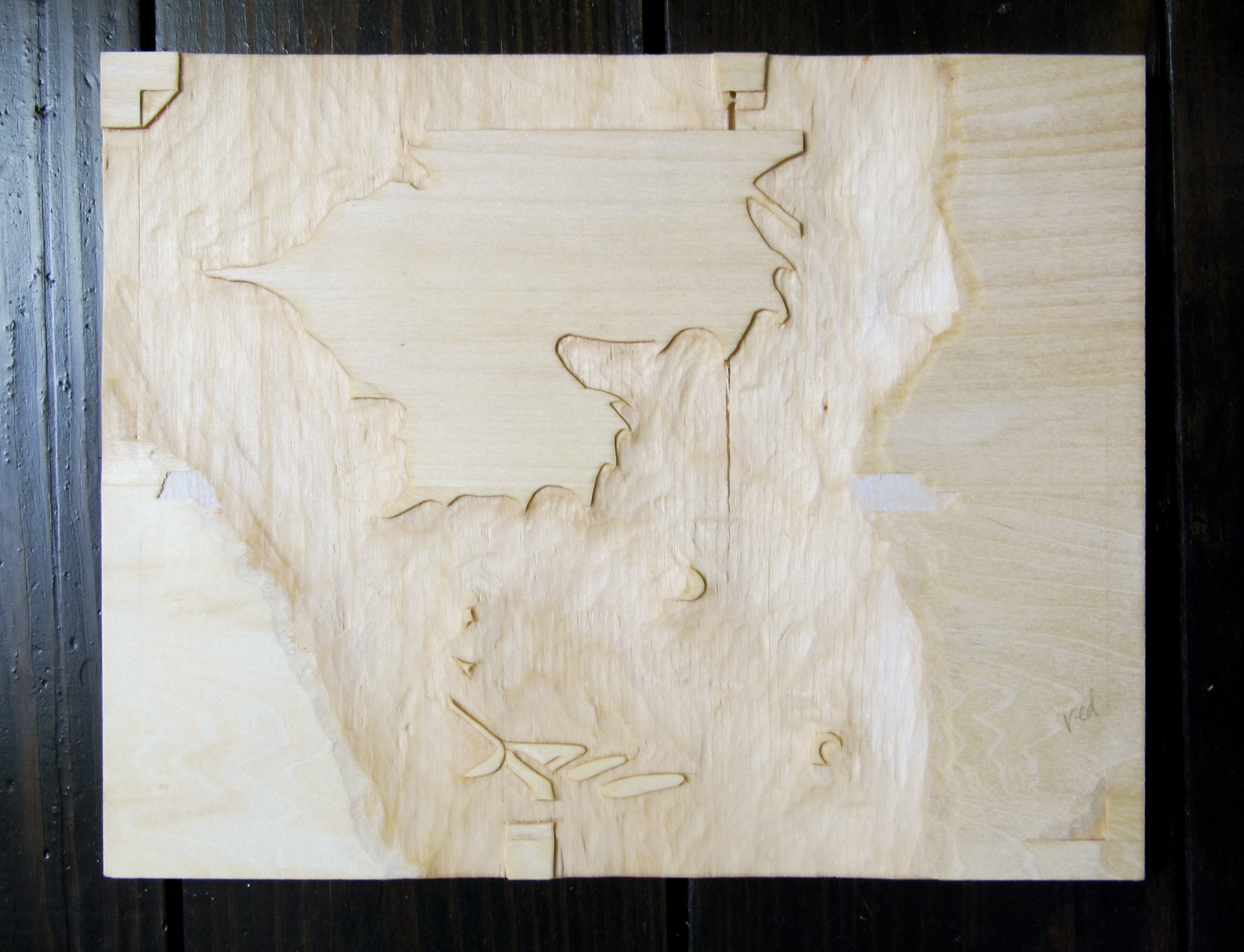
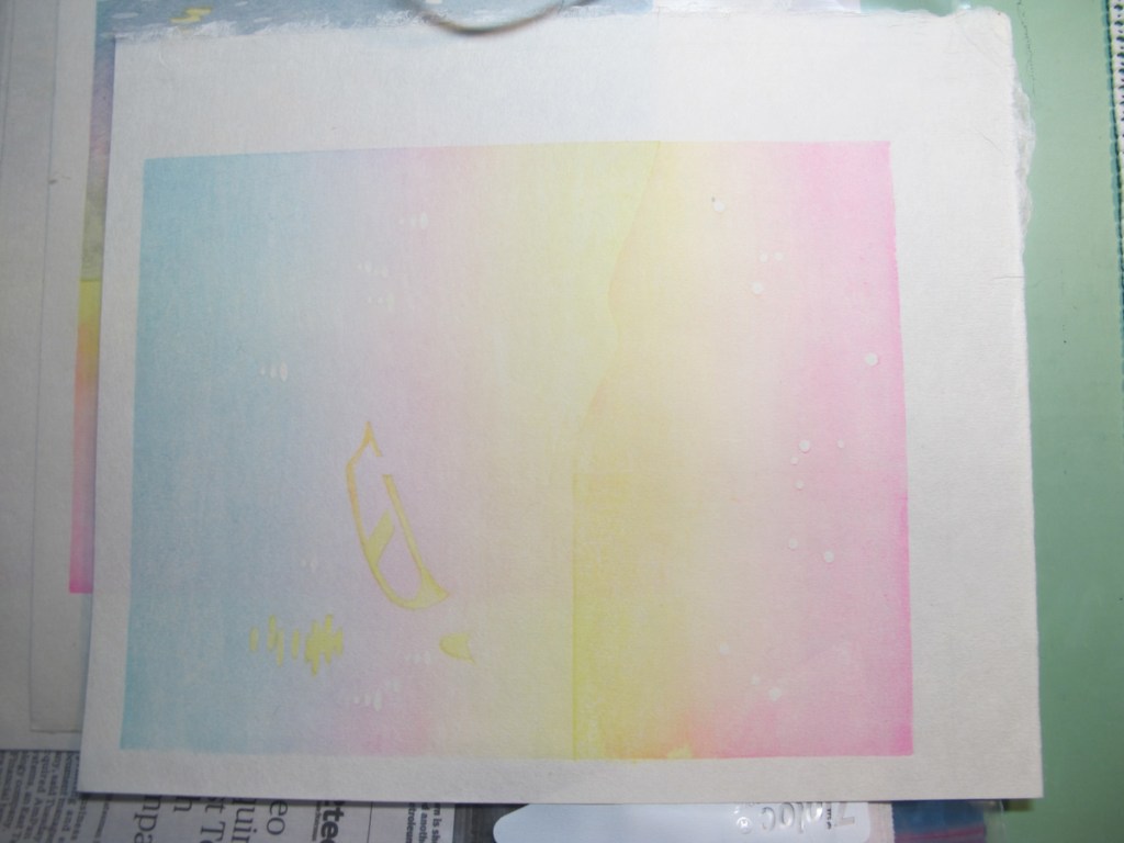
When I started working on the rockpile project, I wasn’t sure where the color would go, what blocks I would need, and so on. I drew and carved the key block, then thought about where the lightest colors would go and carved some color blocks for those, using transfer sheets printed from the key block to locate their edges. I started test-printing in earnest earlier this month, when I had blocks for light grayish, light bluish, green and reddish. First I tested some of the colors I though would be good to use, to see how they overlap and combine to make other hues. I kept notes and spots of color to document the saturation of the pigment I used to print.

After the initial testing, the results of which I showed in the last post, I decided to add some darker shading in some areas. Here are my transfer sheets:
Notice there is a thinner paper of the gampi type laminated on a thicker backing sheet. The lines were printed from the key block, then I marked and colored in the areas of the new blocks that are to remain. The blue is for water and sky shading; the yellow is to darken some areas of the rock, and the pink is for some even darker shadows on the rocks.
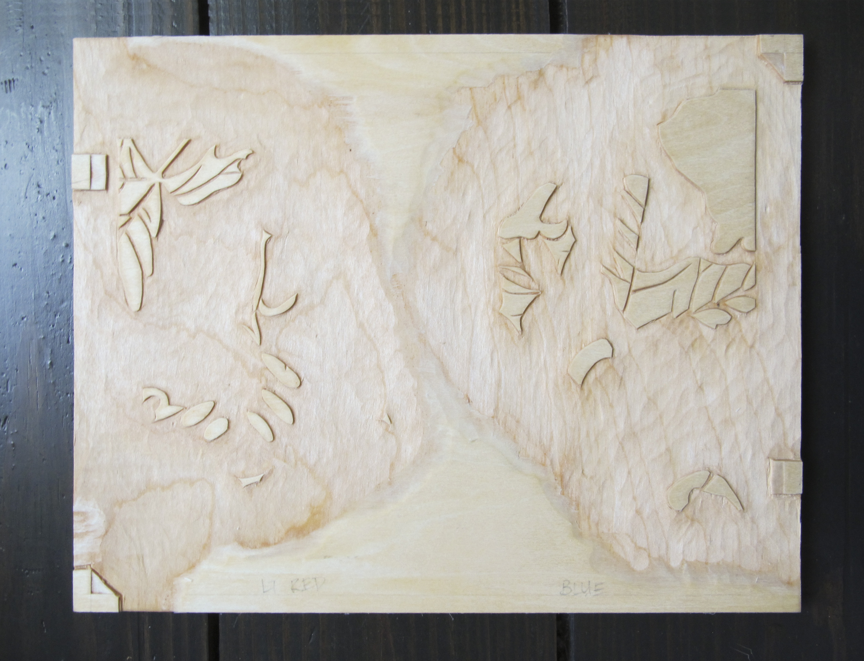
These transfer sheets get pasted UPSIDE DOWN on the new blocks using the same registration marks I’ll later use for printing, the thicker backing paper gets peeled off, and often part of the gampi gets peeled off along with it, leaving the face of the gampi with the lines and colors against the wood and visible through what’s left of the gampi. If it is still too thick, I can moisten it a little on one edge, and peel off another layer.
This block is one I’ve already test-printed from, but shows what the transferred gampi looks like after it’s pasted down and the excess is peeled off. It’s super-easy to see what to carve!

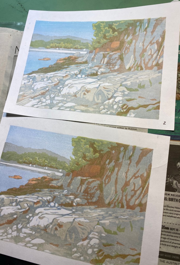
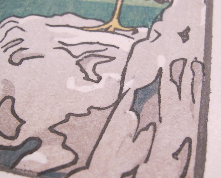
Here are my newest blocks after some test printing, and the two surviving test prints with their new shading.


I think it is starting to come together! I think I need a little more color on the trees on top of the hill, and more definition of the cliff face. I’ll see what I can do with my current blocks (there are 7!), but I might need to do more carving.
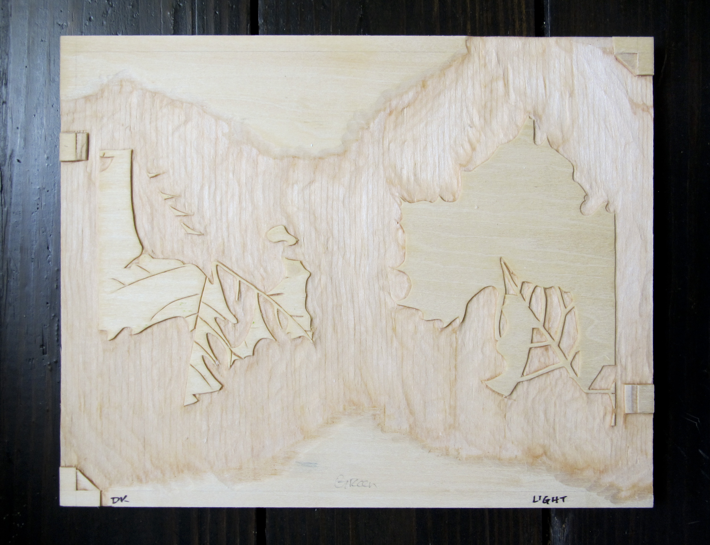
I’ve added another color, burnt sienna, to the two surviving test prints (there were three, but I made the boneheaded move of printing one upside down, of course) . Also the test on top has a bit of a turquoise bokashi that deserves its own block on the sky and water. I might have registration problems with the green; that is too be seen.
Next, I printed the key block lines in a light sumi on test #2.

Many of these lines are way too heavy, but this will let me see which I can trim down, which I can eliminate completely, and where I truly have registration issues. Progress!
It’s been awhile. I finished the Fall print, but not soon enough to send as a Fall card. We have a brand new year. And, I have made significant progress on a new print!
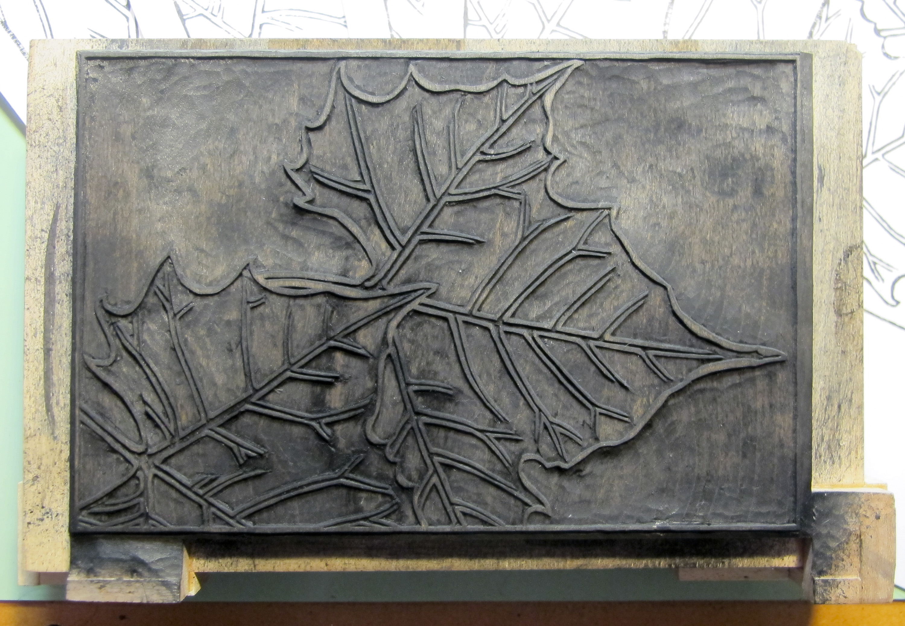
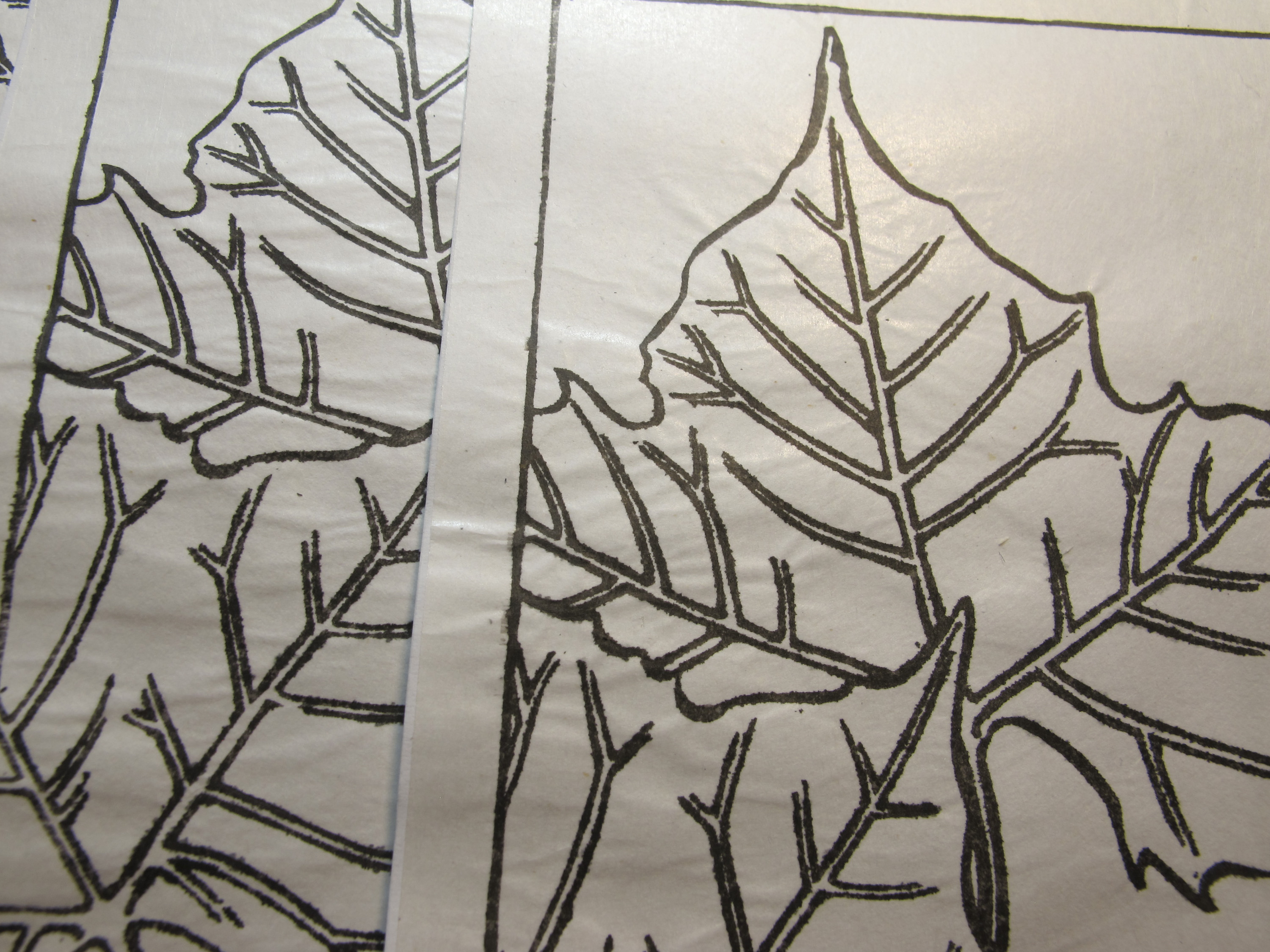
I finished carving the initial key block some time ago. There are lots of lines; it took awhile! Here is is before and after I cleaned off the transfer paper.

My hope for this print is that I can move in the direction of the subtlety and detail of some of the shin-hanga prints. This is an open question at this point! I think it is possible that many of the lines of this block may get replaced later by lines on other blocks, and so be carved away. (This is called “mudabori”, or “wasted carving.”)
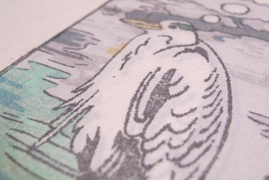
Here’s an early test print showing the key block lines and a light shading block, printed using neutral tint.

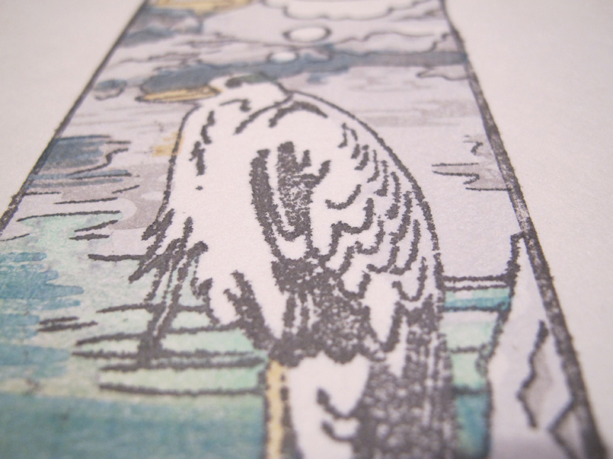
Today I started trying out colors! I’m printing without the key block lines at first, to see which areas work well without them.

One more test print adding some green:

I have one more already-carved block that will add a reddish-brown color. Then I will think about what other blocks are needed, what needs to be trimmed, etc. This one will be long in the making, but I think it will be worth it!
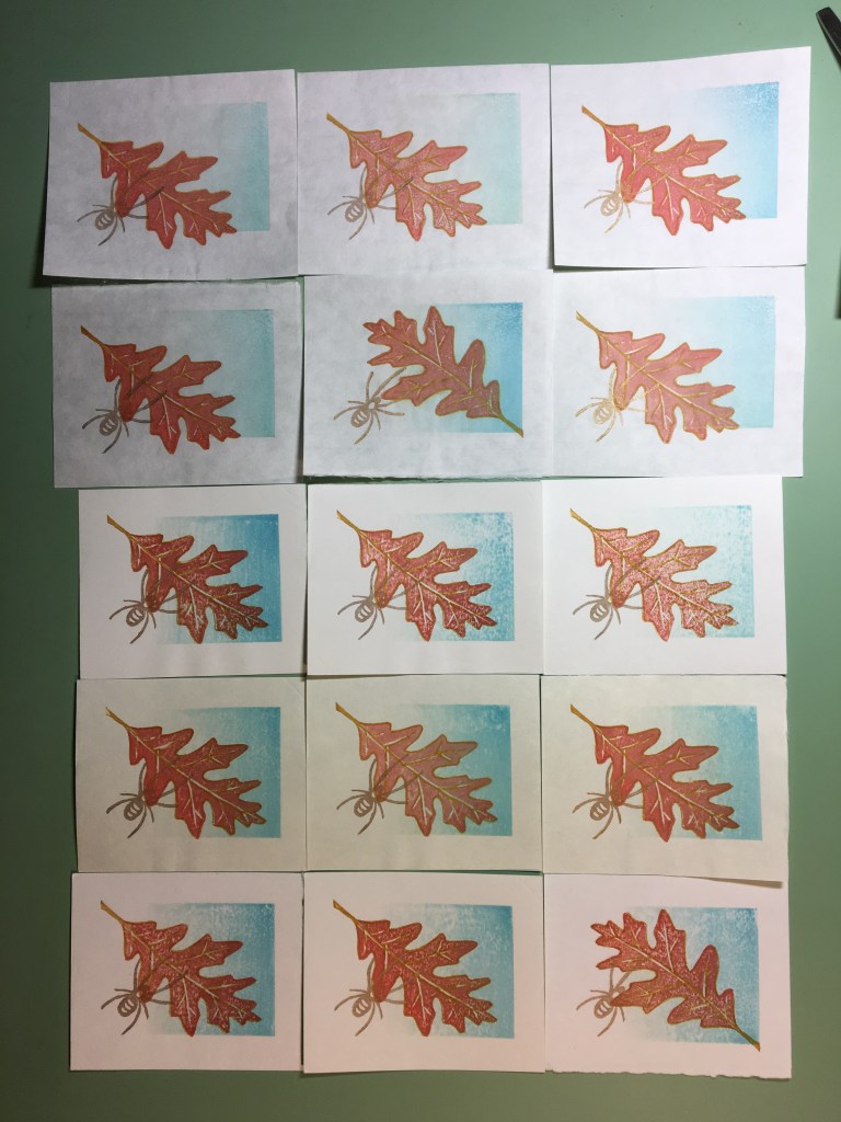
After first learning how to make prints with water-based pigments from Annie Bissett (https://anniebissett.com/home.html) in 2017, I went home and made a tiny (~ 2″ x 3″) little print using plywood samples I had received from various sources, and testing out about 5 different paper types. Most of these ended up being sent out to friends and family as Fall greetings.
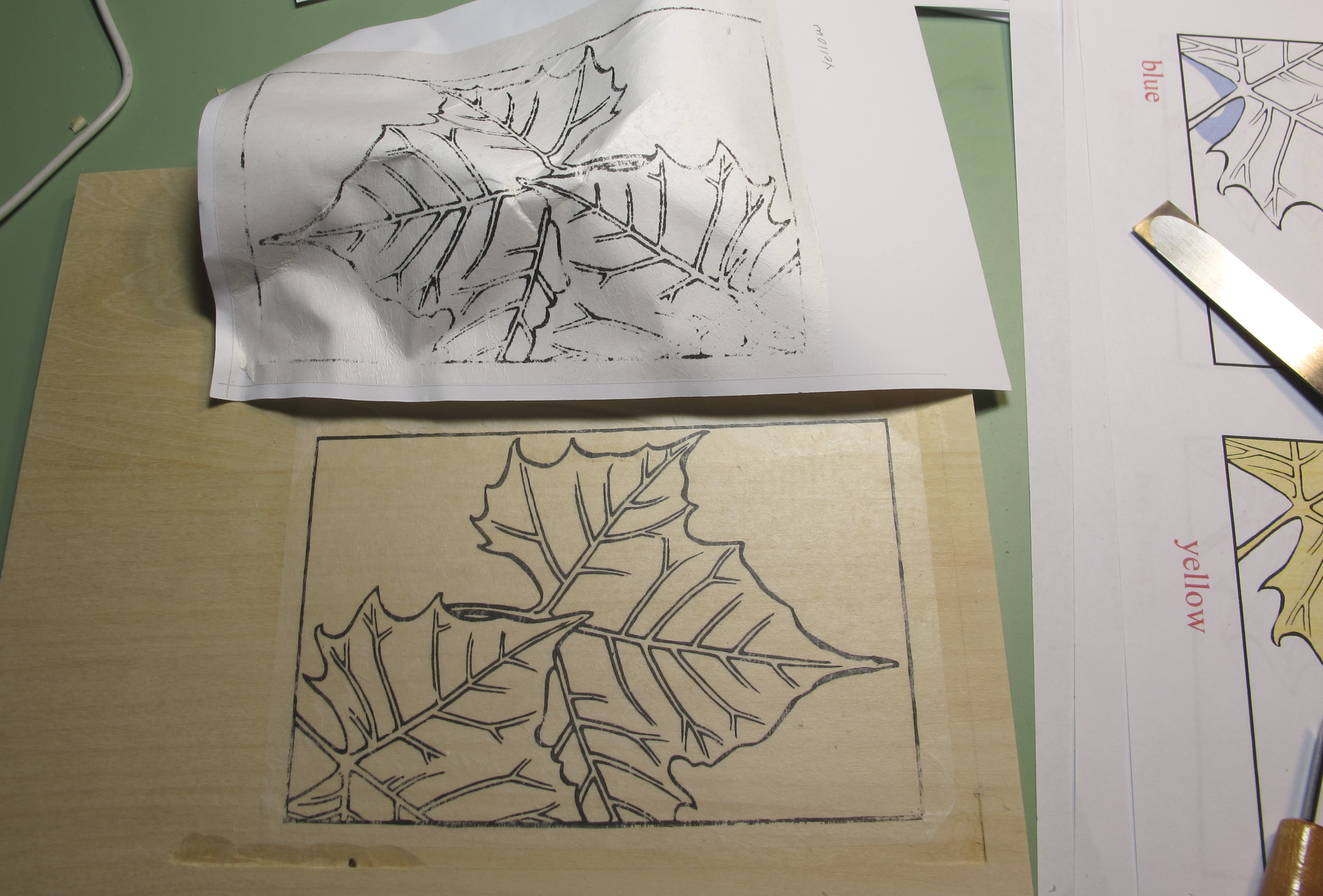
I decided this year to make another Fall-themed print, which I started working on back in June, when I first made the “frankenblocks” from thin cherry and plywood plus applied chunks of wood for registration marks. Sadly, the set of prints is not going to be ready for the official start of Fall, since other things got in the way. The new goal is to have the first printing ready sometime during Fall. Here’s the key block and my first attempt at making hanshita for the color block transfers:
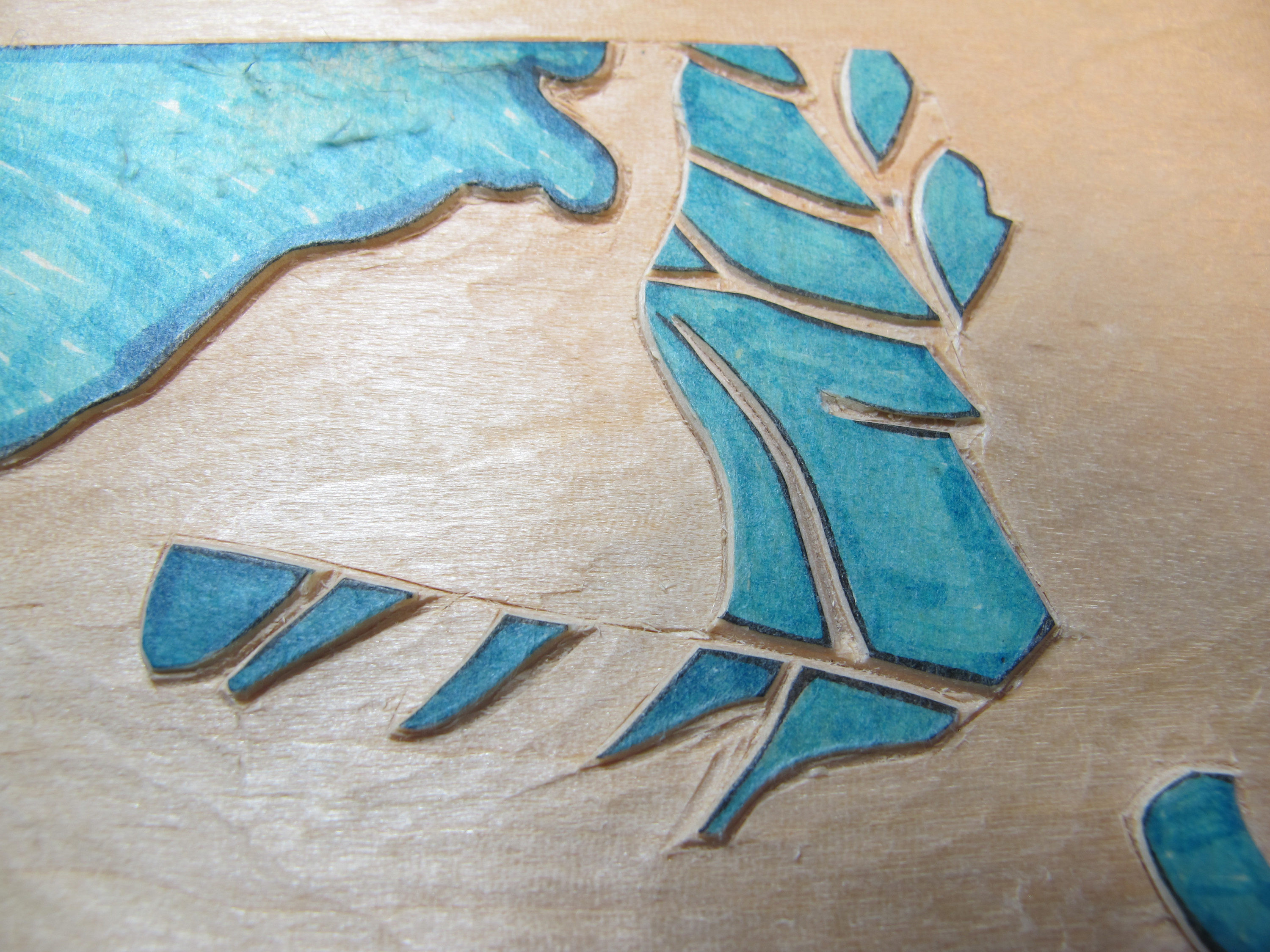
As you can see from the bleeding and the wrinkling, I used WAY too much liquid to print the hanshita. Try 2 turned out OK! When I used the glue I brought back from Japan (the stuff Dave uses to attach line-work transfers), most of the gampi peeled off with the mounting paper.
The transfer above was for the yellow color, which will cover the leaves entirely. Here are some shots of the carved areas for blue and light orange-ish:
And finally, here are the finished color blocks – 6 of them – cleaned off, before any pigment has been applied (yellow, red; light reddish, blue; dark green, and light green).
I will confess, I have done a small round of test printing! The results of that will need to wait until the next post.
I got an Honorable Mention in this year’s Awagami International Miniprint exhibition! Well me and about a hundred or so other people. But hey, it’s better than not!
http://miniprint.awagami.jp/ENGLISH/exhibitions/index2019.html
If anyone takes a picture of my print on display, please leave a note here!
I finished the batch of boatmen! They are already at Mokuhankan in Tokyo, also available online here: https://mokuhankan.com/catalogue/KP02.php.

Here are my printing notes.
I am hereby appointed the ambassador for Grumbacher Academy Payne’s Gray 🙂
I took only a couple of process shots. The first is after impression 3, and the second is after impression 4.

If I were to carve these blocks again, I would try to think of a way to avoid the hard line at the horizon. It’s not just a matter of merging blocks 1 and 2, because the strong yellow on the rim of the boat and the lamp and its reflection need to be independent of the water blocks. But probably dividing responsibilities among the blocks differently could yield a more harmonious horizon.
I’m getting ready to print another round of “By Starlight,” this time on the excellent washi I received from my friends at Mokuhankan, for sale in their shop. When I printed the first batch, I didn’t take notes. So I did a small run on Shin Torinoko (machine made washi) to test out colors.
First I cleaned up the blocks. They were carved mostly with v-gouges and u-gouges, so were quite rough.

After the first few impressions, things are looking really saturated and bright:

I did my best to tame the saturated color with Payne’s Gray. Here is a comparison with one of the original prints, which is on the bottom.

There’s too much yellow in the center, I believe, and the water near the horizon is too green. The upper part of the sky and the lower part of the water look pretty good though! I will do another test before the official printing. But I am happy with how smooth I was able to get the printing in the test prints.
Well, I did not perform any kind of scientific test. I just threw a few of the paper samples I received as an entrant to the Awagami International Miniature Print Exhibition into the batch I printed to produce submissions. So, with a sample size of 1 each, here’s what I ended up with.
The Hakuho Select is a really thick paper that feels really nice in the hand. It’s 45% Kozo and 55% cotton, and is sized. I’ve tried printing with this paper before, and haven’t been able to achieve a smooth impression even using lots of muscle. It always turns out kind of speckly.

Honestly, it is probably a waste of a great paper to use it for a print this small. It would probably perform well on much larger prints, especially those produced on a press.
This paper is also fairly heavy, sized, and made of 70% bamboo and 30% recycled paper. From the first impression, everything went on nice and smooth. It doesn’t compress a whole lot, so I don’t feel the embossed texture as much.
This one is 80% Kozo and 20% “Alpha Cellulose,” which the web says can be separated from wood pulp by soaking it in a solution of sodium hydroxide. This paper is very thin and transparent, and the fibers within are visible when it’s held up to the light. It is not sized. On my initial impressions, this didn’t seem to cause a problem, but when I got to the key block which I printed later, there was significant bleeding:
Finally, a thicker paper, also unsized. 90% Kozo, 10% Alpha Cellulose. It feels good and feels like it would hold up to repeated impressions, but the bleeding was pretty bad:
Printmakers who are willing to undertake a sizing effort could probably make good use of this paper. I’m kind of lazy though and am looking for the ideal paper without having to jump through hoops!
