Fireflies have flown

Uncategorized

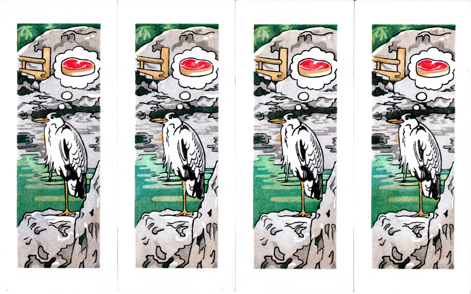
The fireflies are done and are now winging their way to Tokyo. It was hard to part ways with them, but I hope they will find good homes. I ended up with 12 good prints on the good paper; here they are:

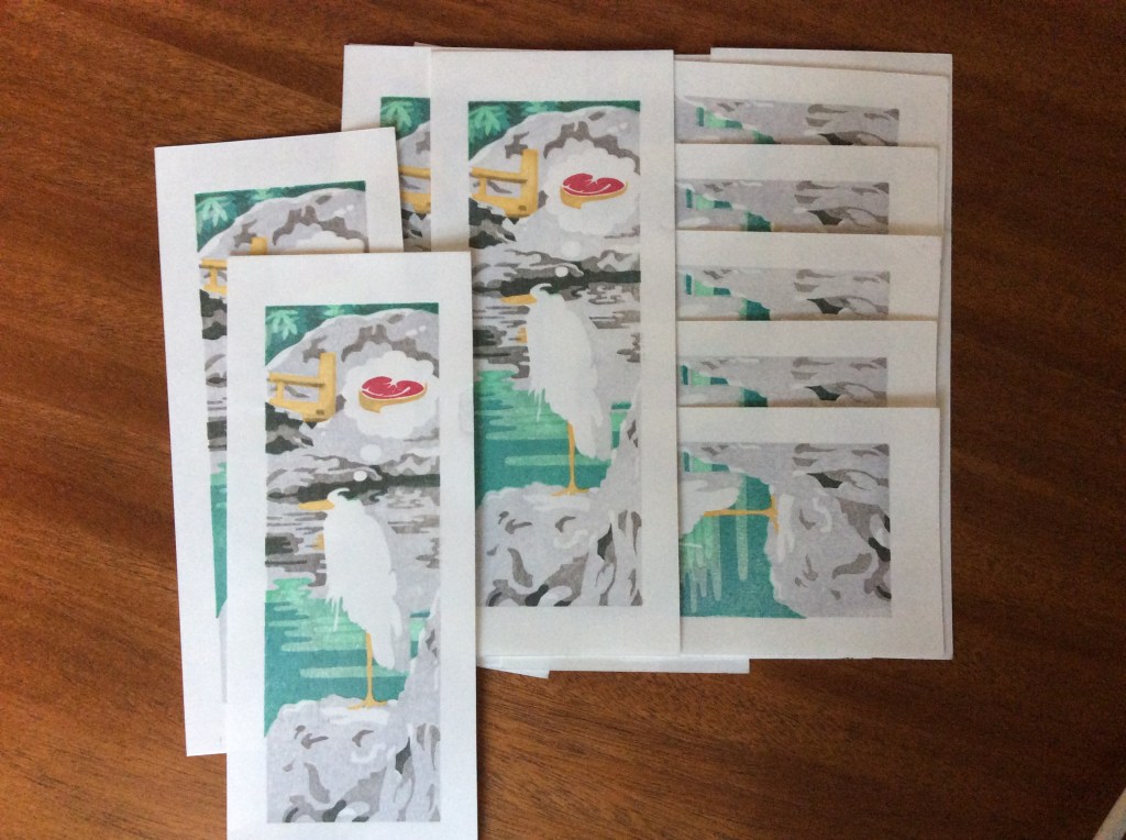
I have more prints on the machine-made paper, but I am not sure what I am going to do with them. I told @the_ungawa that I would post a comparison:

The nice, handmade paper from Iwano san is on the left, and the Shin Torinoko is on the right. The tone of the right-side paper itself is cooler, and this shows in the print. As impressions stacked up, it seemed like the machine-made paper was a little more reluctant to accept the pigment. (I did use a lot of paste, especially in early impressions, trying to achieve a smooth texture. Maybe I could have gotten away with less paste early on to keep the paper from “filling up.”) It’s actually pretty hard to tell with my less-than-stellar photography but the version on the left is warmer and more luminous.

The back side of the print is kind of interesting. Lots of lines are visible in the handmade paper below, but the impressions are much less visible on the Shin Torinoko.

It took me 2 weeks for this run. I wasn’t able to print every day because of work, travel and evening duties. 10 blocks, 12 impressions total:

  1. Cadmium yellow pale (Cotman) 2019-05-27
  2. Quinacridone gold (Turner) 2019-05-29
  3. Olive green (Windsor Newton) & phthalo yellow green (Grumbacher Academy), 3:1 – 2019-05-30
  4. Hooker’s green 2019-05-31
  5. Phthalo green and Payne’s gray, 1:2 – 2019-06-01
  6. Phthalo turquoise and Payne’s gray, 1:4 – 2019-06-02
  7. Phthalo turquoise and indanthrene blue, 1:1? – 2019-06-02
  8. Indanthrene blue 2019-06-03
  9. Indanthrene blue 2019-06-05 to darken impression #8
  10. Phthalo blue red shade 2019-06-06
  11. Phthalo blue red shade + Magenta + sumi 2019-06-09 to adjust color and darken impression 10
  12. Sumi (dilute) 2019-06-10 for the key block.

Heron Project 4

Uncategorized

I’m done with the first series of prints! I started out with 14 on Shin Torinoko (sized, Manila linen and acid free pine pulp, machine made) and 9 on Echizen Kozo (sized, kozo with “a small % of acid free pulp”, handmade) and of course I had some attrition. Only one bone-headed move printing a sheet 180 degrees from the correct angle; some places where the paper contacted a part of the block that was too high; and a few “too crude” impressions with some movement or just too much pigment and goo. I think I have ended up with 10 + 6 prints I can be happy with (perhaps after cleaning up a few spots around the edge that I wish were not there). Aside from the bone-headedness, I can solve most of the errors by deepening my carving.

The Shin Torinoko held up much better under the pressure and friction of the baren than the Echizen Kozo did. I mostly didn’t use protecting sheets (baking parchment) until the end, because I have found that it’s easier to feel what is going on without them. Consequently there were places on the handmade paper that had a lot of wear.

Back-side condition of one of the Echizen Kozo prints
Echizen Kozo on the left, Shin Torinoko on the right.

The Shin Torinoko held up comparatively well. It is just as thick and cushy to print on, but I guess some are suspicious of its pulp content and fear it won’t last as long. Here is a square-on shot of both back-sides, handmade paper on the left:

So you probably want to see what the final prints look like. First, here are a few of the Shin Torinoko prints, followed by a set of their brothers on handmade, Echizen Kozo paper. I was aiming for uniformity, and I think the bottom row was more successful than the top.

…. and a few details:

The left is on the handmade paper, and the right is on the machine-made. Both reveal a problem in my printing: I printed the key block last, and I used some pretty serious pressure in the earliest impressions — like the first one, in yellow. See how the yellow intrudes on the bottom line of the steak, and interrupts the upper right corner? This is not because there is a flaw in the key block — it’s because the paper is soft and squishy, and the yellow compressed it so much that the key block can’t get a complete impression! There are signs of this on the left, too, in the unevenness of the outline of the leg, and in the intrusion of the deep blue green into the mostly vertical outline of the rightmost stone. I almost want to blame the paper — I feel like strong pressure is needed to get a smooth, complete impression, so maybe a paper that is less yielding would give a better result.

Here are the impressions, in order. There are 6 blocks total:

  1. Yellow Ochre (block 1)
  2. Permanent red deep (block 2)
  3. Emerald green (block 2)
  4. Dark gray 1 (dilute sumi) (block 3)
  5. Light gray (neutral tint) (block 4)
  6. Cobalt turquoise (block 5)
  7. Brown + sumi + a little permanent red on the waterline and the rocks immediately above and their reflection (block 5)
  8. Another round of dark gray (dilute sumi) on the handmade paper and some of the others, because they were too pale (block 3)
  9. Olive green (bokashi on the water, complete impression on vegetation) (block 2)
  10. Key block (block 6)
  11. Mystery pale brown bokashi on top and bottom (block 4)

I want to enter this print in the upcoming Awagami Mini Print 2019 Exhibition, so now I need to do it all again on A4 paper.

Heron project 1

Uncategorized

Fish again? Sooooo boring….

Blocks

I started working on this print during my recent trip to Japan. I was gifted a few small off-cuts of cherry-surfaced plywood from the folks at Mokuhankan (mokuhankan.com). These were only 2 3/8 inch by 7 inches, so I opted for a vertical design. Since the pieces are so small, I decided I would use the full surface, and would construct an outside kento – basically a jig to hold the blocks that incorporates registration marks. Using the full surface is sort of risky, because if the edge gets damaged, that affects the image, but I felt it was worth the risk since the dimensions were so small.

Here are the blocks as they were before I started much of the test printing.

dark gray, blue, key block
light gray, green and red, yellow