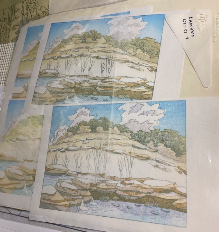
I’m into a second small round of test printing on the Balcones Canyonlands print. This round is mostly focused on reproducibility, but I am also trying out a few variations.

After 3 impressions – hill, sky, and water 
Just one more – the basic rock color.
The first print on a block can be quite light, and then the color deepens over the next few impressions. I think I got the rock color a bit too dark on the bottom left one, in the image on the right.

After 6 impressions, including clouds and shadows on rocks/trees 
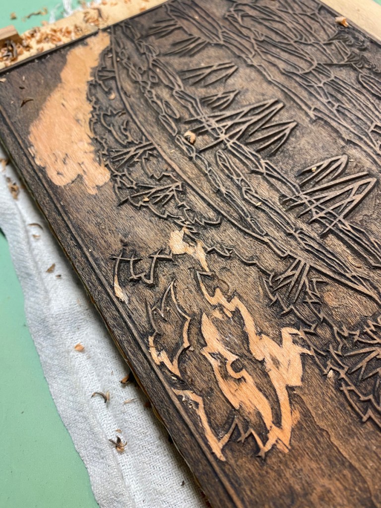
5 or 6 more – general shadows, more tree pigment, rocks in the water, etc.
Not the best photos, but this gives you an idea how the colors combine.
I’m a bit unsatisfied about how dark the shadows are on the clouds in the final image, and am considering moving them to another block. Or really editing this one, or maybe just carving away the cloud part from the shadow block entirely.
One of the variations is the darker rock detail in the final image. The lower prints use a redder color for those areas than the upper prints do.
Another experiment was the pinkish cloud color. I went from a light egg-yolk-yellow on the first, adding a bit mor red as I went, to an almost pink with just a hint of orange on the fourth. I think the version I like the best is the second one, which is the image on the left above.
The final experiment is these leaves. I think I like them, and I think I like the darker ones

You can maybe see a bit of a registration issue with the shadows, which peek over the edge of the ledge in front of the stalks. The next thing I will do is test a correction; I’ve shaved down some thin pieces of scale lumber even thinner, and have tacked them in place on the registration marks to move the paper up a bit.
I went back to the place that inspired this image today. It’s the middle of July, after a couple of weeks of really hot days, many over 100 degrees F. There wasn’t a lot of water before, but now there’s only a trickle over the rocks, and the pool below is almost completely dry. I’m looking forward to some rain!