
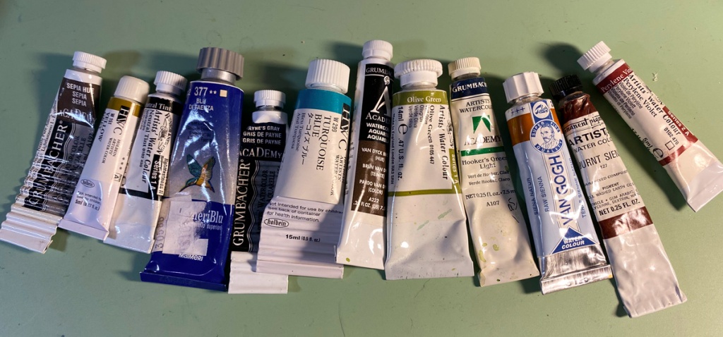
Here’s the array of pigments I’ll be using. All but the perylene violet on the right were used on the test prints. I decided to add some to burnt sienna, which made it more red (dish at the bottom in the second shot), for a bokashi on the red block that can be seen in the most recent impression, which is shown below.

I’ve finished 8 impressions so far. Two for the key block, one for the lightest shading, two for blue, two for the reddish and orangish hues in the dishes above, and one for shading under the trees on the far shore.
The paper I am using is “Shin Hosho” from Woodlike Matsumura. 100% mulberry. It has a darker, off-white tone than the “Shin Torinoko” I am using for testing. I found I needed to use a darker hue for the first, cream-color shading block. I hope I didn’t’ go too dark too soon! The washi is on the bottom here:

Below are example prints after the 7th and after the 8th impression. I am finding it very difficult to get a nice smooth color on this paper. The color blocks are laying down a sort of granular texture despite plenty of paste and a firm baren.


Karen, getting the colour blocks to lay down smother might need to have a slightly damper paper … “Stay Calm keep Printing” Hope all is well with you and your’s
LikeLike
Thanks! I am moving in that direction and will see how it goes! Hope all is well with you too.
LikeLike